| Image |
Comment |
| 02/05/2003 09:07:25 AM |
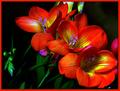
Pretty as a Pictureby RLSComment: wow.. an excellent job with the exposure on this shot for sure.. the colors are brilliant :) = 10 - setzler |
 Photographer found comment helpful. Photographer found comment helpful. |
| 02/04/2003 08:02:51 PM |
Busy Beeby HoogieComment: beautiful macro... the composition and depth of field on this shot are also excellent.. great color as well :) = 10 - setzler |
| Photographer found comment helpful. |
| 02/04/2003 08:01:40 PM |
My Exotic Petby CreativeFlyPhotoComment: incredible macro.. the detail and depth of field on this shot is phenomenal... great work :) = 10 - setzler |
| Photographer found comment helpful. |
| 02/04/2003 08:00:46 PM |
|
| 02/04/2003 04:37:50 PM |
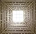
SkyLight ^ 2 by myqylComment: Greetings from the Critique Club :)
Hi Myqyl...
This is an interesting study on perspective and shapes, and congrats on second place :) I like this angle, but I also think this particular subject is begging to be skewed! Taking the skylight more radically off-center would create some more impact and allow the leading lines to play a larger role here. I probably would have underexposed this a few stops also to create some more contrast to keep the color from being flat. This image has great potential as a black and white as well... I think that one quick pass with the sharpen filter would also help out quite a bit in this image. It seems a tiny bit soft to me...
Keep up the good work :)
John Setzler Message edited by author 2003-02-04 16:38:42. |
| Photographer found comment helpful. |
| 02/04/2003 03:40:22 PM |
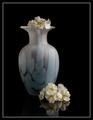
La Primevère (Primrose)by joannsComment: This is a beautiful still life.. i love the reflection on the surface.. great work with the lighting also :) = 10 - setzler |
| Photographer found comment helpful. |
| 02/04/2003 02:25:55 PM |
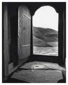
Church Doorby goodtempoComment: Greetings from the Critique Club :)
I really like this shot. I'm lucky this week because I have selected several good black and white images from the CC list... I like black and whites for several reasons. The absence of color forces the viewer to notice things that color usually hides. In this case, the wood grain becomes the subject of this photo. The wood grain contrast along with the symmetry in this shot make a really strong image.
To me, this image is not a 'door'. It's a collection of textures and contrasts...
Great shot!
Keep up the good work :)
John Setzler
|
| Photographer found comment helpful. |
| 02/04/2003 02:13:11 PM |
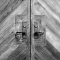
Welcomeby greenem2Comment: Greetings from the Critique Club :)
Hi Greenem2....
This is a great black and white in my opinion. The exposure is perfect.. the darks are dark and the lights are light without any blown out areas.
I really like the 'rustic' aspect of this photo quite a bit. The sense of age presented in this image is appealing to me. The ironwork on the door really sets it off nicely for me.
I have no suggestion for improvement of this image. I don't think what I see here could be improved at all.
One thing that could add a nice element to this photo would be someone standing in the doorway looking out... or maybe the shadow of someone outside on the door... just some thoughts...
Keep up the great work :)
John Setzler
|
| Photographer found comment helpful. |
| 02/04/2003 11:51:28 AM |
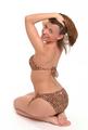
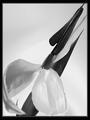
Ode to Mapplethorpeby KarenBComment: excellent shot.. i like the high-key nature of this image.. the detail is excellent :) = 10 - setzler |
| Photographer found comment helpful. |
| 02/04/2003 08:43:12 AM |
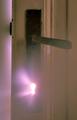
Through the Keyholeby jimmyn4Comment: Greetings from the Critique Club :)
Hi Jimmy...
I think you have a great concept for a 'door' photo with this shot. I actually thought about something like this myself but didn't pursue it. I'm glad I didn't because I don't think I could have done it this well :) I was planning to create a red light and probably desaturate everything but the red channel in the finished result to create some sort of eerie effect with the photo. Your choice of steam to increase the impact of your light blast worked very well also.
I would have probably played around with the exposure on this shot a little to try to create some more definition on the keyhole as well. I think this shot would have even greater impact if the keyhole outline was defined a little more. That may have required a little different light angle so that the light source wasn't hitting your camera lens as directly as well... it may have also cast a really cool beam of light :)
Keep up the good work!
John Setzler
|
| Photographer found comment helpful. |
Home -
Challenges -
Community -
League -
Photos -
Cameras -
Lenses -
Learn -
Help -
Terms of Use -
Privacy -
Top ^
DPChallenge, and website content and design, Copyright © 2001-2026 Challenging Technologies, LLC.
All digital photo copyrights belong to the photographers and may not be used without permission.
Current Server Time: 07/18/2026 08:38:06 AM EDT.