Flag Artby
woodseyComment: 'Tact' is something that is very weak here. You simply have to consider the sources. Your photo is very well done and it's unfortunate that people can't seem to find a way to give you credit for studying and attempting to perfect a technique as part of your learning process. If you go look at the portfolios of those who have given you grief about this, you will see that it would be beneficial for most of them to follow your lead of experimenting and learning by duplicating things you like. If more people around here experimented and learned by doing so, their photography would improve.
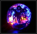
DPC is a 'game' and it shouldn't really be considered an artistic competition. In the real world, your art isn't usually judged by your competition, and it IS judged on its own merit. When you show people this image, they are going to love it and say "wow... how cool is that?" When you show it to photographers, they are going to say "I've seen this before. Why can't you be more original?"
I think you won and lost with this photo. You learned something about a technique. There is still some room for improvement there as well. You lost because the K-Mart shoppers weren't into your blue-light special this week :)
Here are some tips so you can re-shoot this and make it something extraodrinary. This is how I set mine up:
1. I shot it outside in overcast light so it was nice and even without being too harsh.
2. I place my glass about 8 or 9" above the flag, supported by four drinking glasses.
3. Depth of field here is key so I got as close as i could with my camera and shot a couple tests, stopping down my aperture until the water drops were as sharp as they could be and the background was as out of focus as possible.
Keep on experimenting with it and you will find some variations that you like :)