| Image |
Comment |
| 05/02/2003 10:57:31 AM |
Joy, Comfort, and Loveby dacrazyrnComment: excellent image presentation... I personally think it would be stronger if the 'background' was a little more of an even color scheme for some reason... can't really put my finger on it... |
 Photographer found comment helpful. Photographer found comment helpful. |
| 05/02/2003 10:55:39 AM |
Sunset Blue...by andrewlrComment: This is a really neat 'theme' series... I like the feel of multiple snapshots stacked together like this to create a single image. I have seen a few similar concepts in the past and this one works very nicely. I think the overall view could be improved with some nice bordering around the entire frame, as this would make an excellent 'tourist' sale piece for those of us who hope to visit Sydney one day :)
|
| Photographer found comment helpful. |
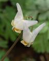
| 05/02/2003 10:06:37 AM |
Dutchman's Breachesby jnevittComment: Greetings from the Critique Club :)
Hi Jnevitt...
I don't believe I have seen this particular flower before, but I definitely like the shape of it. It reminds me of my Bleeding Hearts in some way... tiny and fragile...
I particularly like flower macro shots these days, as I have been trying to do some myself. Composition is important as always and sometimes the exposure can be a challenge in itself, especially with white flowers.
The composition you chose here works very effectively... the diagonal of the stem leads nicely to the small and shapely blooms on this flower. The shallow depth of field also nicely separates your subject from the environment.
The tonal/color range in this photo seems to be just a little flat. I don't know how to really fix something like that when dealing with white flowers without losing the detail on the flower. Those subtle textures are important and over exposure will wash them out very quickly.
This image also seems to be just a tiny bit soft. It could be from a slightly soft focus, but not entirely sure.
Keep up the good work :)
John Setzler
|
| 05/01/2003 04:58:57 PM |
dpc.jpgby dg02Comment: I think it's a good image, but the film theme seems out of place to me... |
| Photographer found comment helpful. |
| 05/01/2003 11:20:18 AM |
|
| 05/01/2003 11:14:46 AM |
|
| Photographer found comment helpful. |
| 05/01/2003 11:13:52 AM |
|
| 05/01/2003 11:10:31 AM |
|
| 05/01/2003 11:09:56 AM |
Untitledby PHOTOCHlXComment: i think a film canister is out of place in a digital photo site... :) |
| Photographer found comment helpful. |
| 05/01/2003 11:07:24 AM |
Your Photo Hereby GeneralEComment: this works better as a flyer of some sort than a sticker... it's a bit busy overall... |
| Photographer found comment helpful. |
Home -
Challenges -
Community -
League -
Photos -
Cameras -
Lenses -
Learn -
Help -
Terms of Use -
Privacy -
Top ^
DPChallenge, and website content and design, Copyright © 2001-2026 Challenging Technologies, LLC.
All digital photo copyrights belong to the photographers and may not be used without permission.
Current Server Time: 06/24/2026 09:50:14 PM EDT.