| Author | Thread |
|
|
05/07/2003 11:19:29 PM |
*Critique Club*
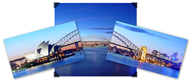
FIRST IMPRESSION: Great photos and a unique layout that works well.
CHALLENGE: Meets the challenge.
COMPOSITION: The composition of botht he individual shots and the combined image is excellent. The centered composition works on the middle shot due to the interesting sky and the overlap of the other shots.
TECHNICAL: Exposure and lighting are excellent. I wonder if a UV filter might have helped remove the apparent haze on the right side of the rightmost shot.
CONCLUSION: Great shot, a nonstandard combination method that really works, and overall deserving of the high score it received. Nicely done!
Thanks for sharing and good luck in future challenges! |
|
 Photographer found comment helpful. Photographer found comment helpful. |
|
|
05/05/2003 06:33:25 PM |
hey this is great ...... you are one creative person.....!!!!!
Message edited by author 2003-05-05 18:34:18. |
|
| Photographer found comment helpful. |
Comments Made During the Challenge  |
|
|
05/04/2003 11:18:07 PM |
|
| Photographer found comment helpful. |
|
|
05/04/2003 10:38:02 PM |
|
Really neat idea. I like how the images are combined. Even at a different perspectives you still can connect it. |
|
| Photographer found comment helpful. |
|
|
05/03/2003 12:47:59 PM |
|
I love the composition you set up. Of course I would like to see it much larger, but what can ya do. Looks like a portfolio set up on a table. Very nice. |
|
| Photographer found comment helpful. |
|
|
05/02/2003 06:03:29 PM |
|
| Photographer found comment helpful. |
|
|
05/02/2003 11:36:46 AM |
this is so beautiful,
I like how you put the 3 shots together :)
well done |
|
| Photographer found comment helpful. |
|
|
05/02/2003 10:55:39 AM |
This is a really neat 'theme' series... I like the feel of multiple snapshots stacked together like this to create a single image. I have seen a few similar concepts in the past and this one works very nicely. I think the overall view could be improved with some nice bordering around the entire frame, as this would make an excellent 'tourist' sale piece for those of us who hope to visit Sydney one day :)
|
|
| Photographer found comment helpful. |
|
|
05/01/2003 01:18:36 PM |
|
Awsome composition. I would frame this one! |
|
| Photographer found comment helpful. |
|
|
04/30/2003 08:41:57 PM |
|
Each photo is well done on its own and you did a great job putting them together. They tell a story and really show off this beautiful city. |
|
| Photographer found comment helpful. |
|
|
04/30/2003 07:29:32 PM |
Stunning photos, and a very creative idea for the compilation.
I give it a 10, my first one so far. Nice work!
JD Anderson |
|
| Photographer found comment helpful. |
|
|
04/30/2003 12:10:59 PM |
|
hey, it's the postcard challenge! nicely done, but perhaps too much empty space on the top sides. |
|
| Photographer found comment helpful. |
|
|
04/29/2003 02:07:08 PM |
|
Oh gosh, what awesome pictuures. The colors are amazing. I don't love the way you framed them, but everything else is perfect. |
|
| Photographer found comment helpful. |
|
|
04/29/2003 01:27:09 PM |
|
Well done. I'm not crazy about all the extra white but I don't see how else you could have done it. Perhaps a second smaller border, with some colour separating the two might have helped. As it stands, it seems unfinished. |
|
| Photographer found comment helpful. |
|
|
04/29/2003 12:21:11 PM |
|
very nice collection of shots. I like the way you put them together too. The only nit pic is the corners on the middle shot, they look too computerized, IMO. |
|
| Photographer found comment helpful. |
|
|
04/29/2003 06:34:49 AM |
|
Amzing effort, a winner for sure. 9 Morgan |
|
| Photographer found comment helpful. |
|
|
04/28/2003 11:54:27 PM |
|
WOW - I really like this picture, but something about the placement of the small photos on the large one makes them look un-even. Anyway, good colors... |
|
| Photographer found comment helpful. |
|
|
04/28/2003 04:54:48 PM |
|
Incredible! This is so very lovely, the embodiment of this challenge! Your composition of these photos is very nice. Very good clarity. 10 Rob the Swash |
|
| Photographer found comment helpful. |
|
|
04/28/2003 01:03:43 PM |
|
Interesting composition. Looks like they were taken at different times of the day. |
|
| Photographer found comment helpful. |
|
|
04/28/2003 12:52:35 PM |
|
Really uniqe arrangement of these photos. This would be superb in a large, poster format. |
|
| Photographer found comment helpful. |
|
|
04/28/2003 11:30:29 AM |
|
Sydney..wow...blue. This is so rich, really nicely done. Creative, inventive, different. Good work. |
|
| Photographer found comment helpful. |
|
|
04/28/2003 10:24:52 AM |
|
Very original concept and layout. This is a nice piece of art. |
|
| Photographer found comment helpful. |
|
|
04/28/2003 09:52:50 AM |
|
Could this be andrewlr? Great photo and different layout.9 |
|
| Photographer found comment helpful. |
Home -
Challenges -
Community -
League -
Photos -
Cameras -
Lenses -
Learn -
Help -
Terms of Use -
Privacy -
Top ^
DPChallenge, and website content and design, Copyright © 2001-2026 Challenging Technologies, LLC.
All digital photo copyrights belong to the photographers and may not be used without permission.
Current Server Time: 06/28/2026 03:53:42 AM EDT.