| Image |
Comment |
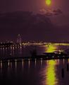
| 05/19/2003 01:07:58 PM |
Moonlight over the harborby johnmkComment: meets the challenge but looks unnatural to the point that I don't care for it... I like a lot of digital manipulations, but I don't care for it in a situation where photography is the primary key... = 4 |
| 05/19/2003 12:53:37 PM |
three pairsby tomzinhoComment: interesting documentary style photo... maybe photograping one pair of bills would have allowed you to bring out some more interesting detail and create a less literal view of the currency. = 4 |
 Photographer found comment helpful. Photographer found comment helpful. |
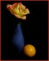
| 05/19/2003 12:44:27 PM |
Light and Shadowby scrooslooseComment: interesting composition... I think there could possibly be a little more lighting on the vase.. a good portion of that is being lost to negative space... it would also help remove the feeling that this stuff is floating in space since there is no visible surface... The red border is a bit distracting...it's competing with your subjects for attention... not a good idea... = 5 |
| Photographer found comment helpful. |
| 05/19/2003 12:35:50 PM |
Reflectionsby mbardeenComment: this is an intriguing architectural photo... with blue reflections like that, I would have focused on the red wall and blue windows and left the sky entirely out of this particular scene... nice work :) = 7 |
| Photographer found comment helpful. |
| 05/19/2003 12:34:44 PM |
|
| Photographer found comment helpful. |
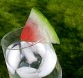
| 05/19/2003 12:28:36 PM |
ATwist on a Twistby BJComment: nice work with the red and green... the background almost looks painted... good work :) = 6 |
| Photographer found comment helpful. |
| 05/19/2003 12:27:47 PM |
Pastel complimentsby ploogieaComment: This is an interesting photo and a good composition as well... I just don't see the complementary color theme here... something needs to be complementing the pink and it's just not here... = 4 |
| Photographer found comment helpful. |
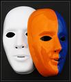
| 05/19/2003 12:26:01 PM |
Mask paradeby AnastasiaComment: nicely done... I think this image would have also been excellent with both masks painted the same way... just for fun, i think two white masks would also work very well here :) = 7 |
| Photographer found comment helpful. |
| 05/19/2003 12:23:07 PM |
|
| Photographer found comment helpful. |
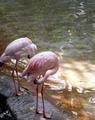
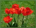
| 05/19/2003 10:26:56 AM |
Christmas in Mayby mariomelComment: these flowers almost look silk... the red appears to be oversaturated... I have this problem with my cam... good complementary colors though... = 6 |
| Photographer found comment helpful. |
Home -
Challenges -
Community -
League -
Photos -
Cameras -
Lenses -
Learn -
Help -
Terms of Use -
Privacy -
Top ^
DPChallenge, and website content and design, Copyright © 2001-2026 Challenging Technologies, LLC.
All digital photo copyrights belong to the photographers and may not be used without permission.
Current Server Time: 06/22/2026 04:32:31 PM EDT.