| Image |
Comment |
| 05/20/2006 01:08:53 PM |
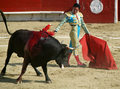
Pointing to the heavensby LustreComment: Greetings from the Critique Club...
Hi sparky_mark :)
The subject you chose for your entry is a good one, but I believe your approach to it could use a little work. The time of day for this particular photo doesn't seem to be a great choice when coupled with the weather. The shadows and highlights are fairly harsh, which is normal for a sunny day. My particular irritation is with the door to the church in the lower left corner. You need to find a way to include that element fully or to remove it completely. I have no idea what the landscape here looks like so I can't suggest any alternative views. This one just doesn't feel comfortable to me.
John Setzler
|
| 05/19/2006 04:51:56 PM |
Desperation: Poverty's Childby L1Comment: Greetings from the Critique Club...
Hi Laurie :)
This photo scored rather well in the challenge and doesn't require much of a critique, but I have a possibly interesting point to offer you. Your choice of sepia toning on this photo may not have been the best option. Sepia toning achieves two effects, for the most part. 1 - it creates an antique feel and 2 - it creates warmth in the image. Neither of these two themes seem to be representative of your theme for this photo. Your photo represents something current, which wipes out the antiuqe nature of the sepia. Warmth and poverty aren't usually associated with each other either.
When you choose a post processing option, be sure to think about 'why' you are doing it. "It Looks Good" is often a valid enough reason, but determining "why" will help you grow :)
John Setzler
|
 Photographer found comment helpful. Photographer found comment helpful. |
| 05/19/2006 04:46:26 PM |
Dangerous Pussy Catsby PixelstateComment: Greetings from the Critique Club...
Hi Pixelstate :)
Congratulations on an excellent score. Please keep in mind that you can go to your photo page at any time during the challenge and uncheck the critique request box. This photo scored very well in the challenge and it's very well executed. I can't suggest any improvement. You should consider gettnig a large print of this one made :)
John Setzler |
| Photographer found comment helpful. |
| 05/17/2006 04:53:36 PM |
"When Two Or Three are Gathered in My Name"by RikkiComment: Greetings from the Critique Club...
Hi Rikki :)
I don't believe this photo needs any critique. It did very well in the challenge. I wouldn't really change anything about this photo. The voters enjoyed it and I think it's a very well done image...
Nice work :)
John Setzler
|
| Photographer found comment helpful. |
| 05/16/2006 10:13:34 PM |
Rhythm of the game ...by ZILAComment: Greetings from the Critique Club...
Hi ZILA :)
Since you didn't provide any of your own thoughts or comments on this image, my critique and comment will be short and sweet...
The only rhythm available in this image besides the title is the repetition of shape within the theme. Even though the photo meets the challenge in this manner, I can find nothing of interest in it. There is nothing wrong with this image, but it just doesn't inspire me in any way. The depth of field is also a bit too shallow. The dominos on the left side of the frame are fuzzy, and I can't see any reason they should be.
John Setzler
|
| 05/16/2006 02:34:35 PM |
The Crimson Dance of Deathby emtmdhComment: Greetings from the Critique Club...
Hi emtmdh :)
Drawing a conclusion of 'rhythm' from this photograph is almost impossible for me, even with the prompting title you gave it. I like the photo as it is composed (could be a little sharper probably) but I just don't think it meets the challenge vividly enough to do well here. Your score probably reflects this sentiment. Some of the comments you received also demonstrate the fact that some subjects are offensive to certain viewers. When this happens, the viewer won't go past being offended to look at the image.
1. Try not to be on the 'fringe' of meeting the challenge.
2. Try to avoid offensive subjects.
Those two tips will improve your score on this site :)
John Setzler
|
| 05/16/2006 12:07:55 AM |
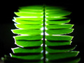
Greenby chugginrailComment: Greetings from the Critique Club...
Hi Chugginrail :)
Since you didn't provide any details of your own on this photo, my critique will be short and simple...
I do see the 'rhythm' in the repeating patterns in this photo. However, I think the composition would be much stronger if you had tilted the camera to create some diagonals. The image would be more dynamic that way.
The lighting here doesn't work for me. The highlights are too bright for the theme, as I see it.
John Setzler
|
| Photographer found comment helpful. |
| 05/14/2006 09:10:40 PM |
Rhythmby Rino63Comment: Greetings from the Critique Club...
Hi Rhino63 :)
Since you didn't supply any details about your photo, my critique will be short and simple...
This is an insteresting study of lines and shapes which do offer some sense of rhythm within the image. The small line in the bottom left corner of the frame is a bit of an eye catcher... that should possibly be removed from the image...
John Setzler
|
| Photographer found comment helpful. |
| 05/14/2006 01:03:10 AM |
"Use your enemy's hand to chatch a Snake"by ThaiComment: Greetings from the Critique Club...
Hi Thai :)
Here's some sound advice for you: Never submit an image that is less than 640 pixels on the longest side.
I don't think this photo does a great job of conveying your saying. This photo is also a bit of a compositional disaster. There is a lot of discontinuity in the lines, curves, shapes, and objects within the frame. There is also no reason this photo shouldn't be sharp throughout. It's a bit soft on the left side of the frame.. possibly motion blur from the slow shutter speed or from the shallow depth of field at f/2.8.
Better luck next time :)
John Setzler
|
| 05/13/2006 09:37:05 AM |
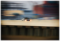
moving forwardby jaxsondComment: Greetings from the Critique Club...
Hi jaxsond...
This photo scored above average in the challenge. It's a well-executed pan shot. The panning and slow shutter speed created a nice sense of movement in the frame.
Based on your comment, this may have just been a random or experimental photo rather than something you set out to achieve. Experimentation is always good and learning/practicing technique is also. I don't think I can offer you much more critique than you have already received in your comments. Cpanaioti's comment hits the points I would make myself. I don't care for the composition choices here. The technique, however is good, which brings me to another point that I have made in these forums before...
Here on DPChallenge, interesting technique seems to perform well regardless of subject interest. In other words, this particular photo without the panning technique probably would not have much appeal at all. Even with the technique, the photo doesn't inspire me in an artistic sense beyond 'stock' or advertising use, as mentioned in your comments on the photo. It falls into a category of art that has business value, but it's not something I would consider hanging on my wall at home or in an art gallery. These photos seem to do well here though, which I can't offer a solid explanation for. My observations only lead me to believe that, in a community such as this where the majority of participants are novice photographers, visual appeal carries as much weight as emotional impact. Lots of winning photos here don't transcend the eye candy barrier into the realm of emotional appeal. Emotional impact is difficult to achieve, and a lot of novice photographers never attempt it or allow themselves to get wrapped up in the significance of the moment. We get wrapped up in technique BECAUSE it does well. Since they do well, we sometimes spiral into a vortex of unemotional but visually appealing imagery.
On the other hand, mastering technique and camera control in general is an excellent step in the road to success. Those who master both will have better results in whatever goals they set.
John Setzler
|
| Photographer found comment helpful. |
Home -
Challenges -
Community -
League -
Photos -
Cameras -
Lenses -
Learn -
Help -
Terms of Use -
Privacy -
Top ^
DPChallenge, and website content and design, Copyright © 2001-2026 Challenging Technologies, LLC.
All digital photo copyrights belong to the photographers and may not be used without permission.
Current Server Time: 06/10/2026 04:42:36 AM EDT.