| Image |
Comment |
| 10/14/2003 07:36:29 PM |
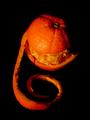
Split for lunch?by visitorComment: Nice shot... good work with the lighting and thanks for presenting this banana in a way that is visually appealing :) |
 Photographer found comment helpful. Photographer found comment helpful. |
| 10/14/2003 07:34:45 PM |
Fighting for exposure against all oddsby Bela45Comment: I can't find anything visually appealing in this photo. The image, overall, is 'contrasty' or 'busy' and the subject choice doesn't inspire my imagination or my senses. |
| 10/14/2003 07:33:48 PM |
|
| Photographer found comment helpful. |
| 10/14/2003 07:33:01 PM |
Repairs neededby pcodyComment: This subject seems photo worthy, but this particular angle leaves the image flat with no depth perception at all. |
| Photographer found comment helpful. |
| 10/14/2003 07:32:25 PM |
Unpeeledby dsa157Comment: I have come to this image a few times and can't put my finger on why I don't like it. I think it's a combination of the color cast and the lack of 'surface' that makes it appear to be floating in space. |
| Photographer found comment helpful. |
| 10/14/2003 07:31:31 PM |
Inside Natureby MonaComment: Interesting macro subject. The lighting seems a bit harsh. |
| Photographer found comment helpful. |
| 10/14/2003 07:11:23 PM |
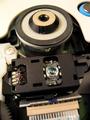
CD-Rom Driveby ExcelsiorComment: Interesting composition but the focus is a bit soft overall. I can't determine any particular advantage here by not bringing some element of the subject into sharp focus... |
| Photographer found comment helpful. |
| 10/14/2003 07:10:30 PM |
|
| Photographer found comment helpful. |
| 10/14/2003 07:09:14 PM |
|
| Photographer found comment helpful. |
| 10/14/2003 07:07:23 PM |
|
Home -
Challenges -
Community -
League -
Photos -
Cameras -
Lenses -
Learn -
Help -
Terms of Use -
Privacy -
Top ^
DPChallenge, and website content and design, Copyright © 2001-2026 Challenging Technologies, LLC.
All digital photo copyrights belong to the photographers and may not be used without permission.
Current Server Time: 06/20/2026 11:03:33 PM EDT.