| Image |
Comment |
| 03/20/2013 10:30:57 AM |
Eleanorby NikonJebComment: Great capture. Love the quizzical look. Great lighting. |
 Photographer found comment helpful. Photographer found comment helpful. |
| 03/06/2013 12:26:23 PM |
Vby cheitoComment: A ribbon on your first entry! Congratulations. (Some of us celebrate last place as a "brown" ribbon.) Not enough info to form an opinion on your ability or intent, but welcome to dpc! Looking forward to seeing more entries from you. |
| 03/06/2013 11:46:49 AM |
|
| Photographer found comment helpful. |
| 02/18/2013 11:17:03 AM |
walking through milkby posthumousComment: Never understood why this doesn't relate to folks.
For me, the path has always had strong meaning - a metaphor for the course of one's life, the result(s) of a choice, walking alone, walking with others, overcoming difficulty or discomfort (like walking barefoot through the snow), etc.
I especially like the "contrarian" shadows of branches crossing the path.
|
| Photographer found comment helpful. |
| 02/18/2013 11:12:48 AM |
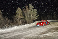
Sponsored by Yogurt...by ShutterRevComment: Guess now you know why not. I really like this shot - truck is sharp, wheels blurred, dust kicking up. And yes, it is busy, but I'm guessing you wouldn't have much success trying to get all the folks to move their rigs... ;-p |
| Photographer found comment helpful. |
| 02/18/2013 11:08:23 AM |
|
| Photographer found comment helpful. |
| 02/18/2013 11:06:18 AM |
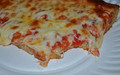
What's pizza without dairy?by nygoldComment: Voters really didn't like this, huh? Regardless of the actual effort put into the shot, it looks like a piece of pizza flopped on a paper plate, and a flash picture taken of it - perceived lack of effort must be thoroughly punished.
The other thing you could play with (since this is Advanced editing) is using "dodge" or "darken" on the white hot spots of light from the flash or light source - even if they were off-white to grey, they wouldn't stand out quite as much. |
| Photographer found comment helpful. |
| 02/18/2013 11:00:24 AM |
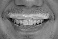
My Buttermilk Heroby albrixComment: Keep in mind this is a critique of the picture, not of the photographer. Crop - I think you've chosen well for the crop - enough space left, right, top, and bottom - nose gives additional context, even though it is cut off. Vignetting - not enough to be a visually significant factor.
I think three things that really hurt your score are:
No white whites - yeah, I know buttermilk isn't white, but since it is in b & w, you could make it look white. As it is, the "whitest" part of the pictures looks like a very unattractive (even repulsive - especially on teeth) grey.
Lighting - I am no expert on lighting, but the picture's lighting makes this look like a dentist shot, with wet, icky teeth - pulling attention away from the milk-stache.
Stubble - little sprouts of facial hair are not attractive - either clean shaven, or a nicely trimmed mustache would work better.
|
| Photographer found comment helpful. |
| 02/13/2013 08:50:30 AM |
Gust in the Windby dtremainComment: Originally posted by hahn23:
Good flag shot. I like the composition. The tree branches provide a cluttered, and therefore distracting, background. |
I was trying to use them as a frame. Smile. |
| 02/08/2013 11:14:41 AM |
|
| Photographer found comment helpful. |
Home -
Challenges -
Community -
League -
Photos -
Cameras -
Lenses -
Learn -
Help -
Terms of Use -
Privacy -
Top ^
DPChallenge, and website content and design, Copyright © 2001-2026 Challenging Technologies, LLC.
All digital photo copyrights belong to the photographers and may not be used without permission.
Current Server Time: 07/18/2026 02:20:11 PM EDT.