| Image |
Comment |
| 10/09/2009 07:49:32 PM |
Nest Eggby scalvertComment: Great idea. Maybe a blue jay or raven's nest - don't they collect bright baubles to hide? The lighting and refractions of the gems are very nice. |
 Photographer found comment helpful. Photographer found comment helpful. |
| 10/09/2009 07:48:26 PM |
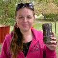
Treasure or TROUBLE??by DamzelComment: There are lots of things I like about this shot. Love the bright pink shirt & matching lipstick. Nice indeterminate expression - makes me want to know more about what she is thinking. However, the orange earrings and red steps / bookcase clash with the pink. Also, if the photog was able to take about 1 step to the left, the fence post would have disappeared behind the cache, the steps / bookcase would have been out of frame, and her head would have hidden the white blob above her left ear. |
| Photographer found comment helpful. |
| 10/09/2009 07:42:13 PM |
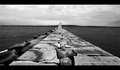
Lighthouse at the end of the Jettyby JaimeVinasComment: When you're doing a centered image, being off just a little is very noticeable. To me, this looks like the camera position wants to be just a bit to the right (photographer's perspective). Somehow I'm also bothered by the horizon bisecting the house. A lower perspective would have put the house in the sky (or maybe just sitting on the horizon). I like the strong sense of visual deception created by the angles of the sides of the jetty, leading your eye to the light house. |
| Photographer found comment helpful. |
| 10/09/2009 07:33:25 PM |
|
| 10/09/2009 07:32:43 PM |
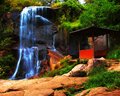
The Secret Gardenby superclaryComment: This looks like a beautiful spot. To me, the shot looks very over processed. I'd also suggest cropping a bit closer on the lower edge. This would still include the path, but would make the shot feel a bit wider angle. |
| 09/27/2009 09:04:37 PM |
Still Life with Grapes and Wineby oscarthepigComment: Wonderful shot. Don't know what you used for the cloth, but it was perfect. Nice lighting for grapes and absolutely no shiny spots on the bottle. I agree with the "looks like a painting" comment.
Congratulations on 4th!
|
| Photographer found comment helpful. |
| 09/25/2009 10:54:08 PM |
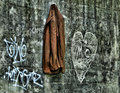
A Storyby heidaComment: Well shut my mouth! I was definitely focused on a different aspect of your style, and gave it a 6. It definitely tells a story - just isn't clear what story it tells. Gave me the creeps. Not sure if the man is looking over his shoulder concerned about something that might hurt the girl, or to be sure no one is watching him...
Thanks for entering, and thanks for the great images you entered earlier.
|
| Photographer found comment helpful. |
| 09/21/2009 10:21:02 PM |
Home is where...by Yo_SpiffComment: I was one of your 8's. I really like the color contrast of the coat with the concrete and chalk - besides it being outdoors. The HDR really made the textures of the coat stand out. |
| Photographer found comment helpful. |
| 09/15/2009 06:33:27 PM |
Seascape with boatsby Rino63Comment: The reds come out over-done on the blurry foreground boats. Nice reflections of the lights in the water. |
| Photographer found comment helpful. |
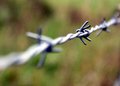
| 09/10/2009 11:00:12 PM |
Wireby danculwellComment: Take a look at my scores, and weigh my input accordingly. One man's opinion...
This is an excellent shallow depth of field shot. I'm not a fan of blurry foregrounds, so...
More specific to this shot is that you have too much distraction from your main point. My eye has to search for the intended primary point of the image. There are two things working against the shot here. While the strand starts in basically the lower left corner, and proceeds to the upper right, there is too much lead in before you get to the in-focus section. The back ground is a nice relatively uniform bokah - almost boring in its uniformity. IMO, the image wants to start about 1/2 way between the two fore barbs, and end just before the last barb. For example:

Only editing I did for this was crop, sharpen, and save for web. Don't know if your shot would benefit from Neat Image or not - sometimes I really like what it does - other times not so much.
I like your creativity and trying out some "different" shots. Just seems to me like you didn't quite get the bang you were looking for.
Edited by author - I wrote this before reading the other comments, so forgive the duplication... Message edited by author 2009-09-10 23:03:09. |
| Photographer found comment helpful. |
Home -
Challenges -
Community -
League -
Photos -
Cameras -
Lenses -
Learn -
Help -
Terms of Use -
Privacy -
Top ^
DPChallenge, and website content and design, Copyright © 2001-2026 Challenging Technologies, LLC.
All digital photo copyrights belong to the photographers and may not be used without permission.
Current Server Time: 07/27/2026 06:20:19 PM EDT.