DPChallenge: A Digital Photography Contest You are not logged in. (log in or register
 
Browse Settings
Currently viewing:
Memberfrisca

Show comments:

Per page:

Order:

Comments:


Comments Made by frisca
Pages:   ... [96] [97] [98] [99] [100] [101] [102] ... [141]
Showing 981 - 990 of ~1402
Image Comment
Point No Point Lighthouse
05/07/2003 04:06:53 PM
Point No Point Lighthouse
by robbieh

Comment:
nice angle on the lighthouse. A crop of the foreground would cut out those not very attractive driftwood logs and keep attention on your subject.
Photographer found comment helpful.
Cable Car Xing
05/07/2003 04:05:48 PM
Cable Car Xing
by Gotchya

Comment:
the crop seems a little tight at the top of the sign..maybe a another few millimetres of sky above it? Also, the graffiti on the sign is really a shame, and takes away from the "beauty" of the scene.
Photographer found comment helpful.
Texas
05/07/2003 04:04:25 PM
Texas
by DennisF

Comment:
From the thumbnail I thought this was a real cowboy's boot, I almost wish it was, but still I love the idea. The shot is a bit dark near the top right of the frame, but that does give you a more even background to put readable text on so it all works.
the old tobacco warehouse - brooklyn, new york
05/07/2003 04:03:02 PM
the old tobacco warehouse - brooklyn, new york
by tomzinho

Comment:
I love how you captured the bridge and this old build's beautiful archways in one shot. The contrast of the red brick against the cold stone and metal bridge and blue sky make for a very stunning composition.
Photographer found comment helpful.
Rite of Passage
05/07/2003 03:01:48 PM
Rite of Passage
by DougPaz

Comment:
Hello from the Critique Club, Doug!

After all the discussion about the eroticism in this picture, I was amused to get it as my critique subject! I'm trying a new CC format for me, so let's hope its helpful!

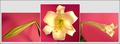
Challenge requirements: Triptych

Its three pictures, put together to say something, here, the life of an easter lily, and I think you've achieved that beautifully.

Each shot is well placed in its frame, though I think I would have preferred more of an angle on the centre picture, I feel like I'm falling into the flower. I like how the first and third shot mirror each other.

I like the way your lighting picked up the shades in the first picture, but it blew out the highlights in the centre picture, which also seems a bit jagged along one edge, possibly due to your post processing. I'd also say the focus is a little soft, but I'm not sure I trust this monitor, so I won't push that point at all, besides, a little softness is nice, gives a warm feeling.

The uneven heights of the pictures are what detract from an otherwise fine entry. A lot of the comments below touched on the excess space above the side shots. I think I would have preferred a less tight crop on all three pictures to really bring out the contrast with the background and then presented them in equal sized frames. Also, that leaf in the right shot distracts just a tad from your symmetry.

As for the "eroticism" its pink, its open, the two side shots are mildly phallic.. but I'd say the subtle sexuality adds a sense of lushness to it all, and that's always appealing. :)
Photographer found comment helpful.
Edinburgh Castle - Scotland
05/07/2003 01:00:37 PM
Edinburgh Castle - Scotland
by agwright

Comment:
magnificent! I would have liked to creep up on the castle a bit more, but I recognize that the terrain might not have allowed you to get closer and still be able to see the castle on a high enough plane.
Photographer found comment helpful.
Tecklenburg
05/07/2003 12:58:12 PM
Tecklenburg
by Anastasia

Comment:
quaint. i've never been to tecklenburg, but i feel like this postcard does a good job of conveying what it is like. Quaint, charming, and slightly hilly! :)
Photographer found comment helpful.
Baltimore Inner Harbor
05/07/2003 12:56:30 PM
Baltimore Inner Harbor
by GolferDDS

Comment:
the buildings, water and boats seem a bit dark, I wish they were brighter so we could see more of their detail.
welcome to georgia
05/07/2003 12:53:04 PM
welcome to georgia
by gisele

Comment:
I think the fact that I'm not american causes this picture not to make a lot of sense to me. I like to think of a postcard as reminding me of somewhere I've been or the person who sent it to me (if its not of some landmark or landscape), but I just don't get that feel here. Compositionally, I think the crop is a bit tight around the top of the clock and I wish we could see more of both the basket of peanuts and the clock itself.
Museum of Civilisation
05/07/2003 12:50:59 PM
Museum of Civilisation
by kosmikkreeper

Comment:
I love this place, and I think you really captured the essence of its flowing architecture, i like the "yingyang" balance you have with half the frame as sky and the other half as the flowing lines of the building.
Photographer found comment helpful.
Pages:   ... [96] [97] [98] [99] [100] [101] [102] ... [141]
Showing 981 - 990 of ~1402


Home - Challenges - Community - League - Photos - Cameras - Lenses - Learn - Help - Terms of Use - Privacy - Top ^
DPChallenge, and website content and design, Copyright © 2001-2025 Challenging Technologies, LLC.
All digital photo copyrights belong to the photographers and may not be used without permission.
Current Server Time: 09/09/2025 09:55:02 AM EDT.