| Author | Thread |
|
|
05/16/2003 01:05:10 PM |
A Comment From The Critique Club
Hi Gisele, welcome to DPChallenge :)
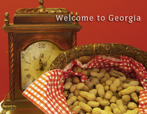
My first reaction upon seeing your photo was a surprise of seeing peanuts. . . I'd heard of the Georgia peach but not that Georgia is also famous for its peanuts. You learn something new every day! But your photo does meet the challenge, having something typical from the state in it and a typical postcard slogan, too.
COMPOSITION / CONTENT - I like how you have arranged the peanuts in the basket with the cloth or napkin and how you cropped it. That part of your photo has a nice dynamic feeling because of it. The napkin goes perfectly with the background. I don't quite understand why the clock is there (but then, I also didn't know the reason for the peanuts), so I can't really comment on the fact that it is included in the photo. For me, it seems a bit out of place, not connected with the peanuts, but that might just be the missing context. I don't like the angle and crop on the clock so much. The tip is missing, and because it is such a little bit that's missing it looks a little accidental. Due to the angle you took the photograph from (from higher up), the clock also doesn't seem quite straight, which is very apparent when it is right at the edge of the photo.
CAMERA WORK / TECHNICAL - The image is nicely focused and the DOF is good, too. There are no heavy shadows (barely any shadows at all), which works well for a setup postcard. Overall, I seem to detect a little yellow tinge to the photo, that might be due to the light you used. Playing around with your whitebalance on your camera before you take the picture or desaturating yellow a bit in post-processing might alleviate this.
POST-PROCESSING - The font and size of text that you added is nice, personally, I would've considered splitting it up into two lines and moving it to the right so it doesn't overlay the clock. Also play around a bit with the levels and hues to make the image "pop" a little more, right now the colors look just a tad flat (that's always a drawback of that nice even lighting).
Overall, I agree with the comments you got ... a nice change from all the landscape postcards. Playing around with the post-processing a little more would probably improve the photo further.
Please let me know if you have any questions or comments about this review.
Franziska. |
|
 Photographer found comment helpful. Photographer found comment helpful. |
Comments Made During the Challenge  |
|
|
05/08/2003 11:12:00 PM |
|
This made me think of one time when we were down south and we walked into a resteraunt and there were peanut shells all over the floor. I was shocked to see people just chucking the shells all over the floor. I found out later that it's illegal now in MI to do that because it's a health violation. Anyway, I thought it was pretty cool. So this shot brings back a "down south" memory for me. I only wish it were a bit sharper. It's not bad, but I think it could be bette. ~Heather~ |
|
|
|
05/08/2003 12:16:35 PM |
|
Interesting... This makes me think that Georgia is all about peanuts and.... time? I must be missing something. |
|
|
|
05/07/2003 11:29:41 PM |
|
|
|
05/07/2003 09:28:15 PM |
|
Very interesting. one of only a few who chose something other than a landscape. Good job. Jacko. 8 |
|
|
|
05/07/2003 12:53:04 PM |
|
I think the fact that I'm not american causes this picture not to make a lot of sense to me. I like to think of a postcard as reminding me of somewhere I've been or the person who sent it to me (if its not of some landmark or landscape), but I just don't get that feel here. Compositionally, I think the crop is a bit tight around the top of the clock and I wish we could see more of both the basket of peanuts and the clock itself. |
|
|
|
05/06/2003 01:07:47 PM |
|
The set up is just a little too staged and unnatural for me. The reds are overwhelming, but the gold tone is really nice. I think the text would have been better at the far corner. Hope this is helpful. |
|
|
|
05/06/2003 09:50:26 AM |
|
Good idea, I've seen far too many landscapes and cityscapes and not many of much else. The color combination is good, yellows and reds. It works well. |
|
|
|
05/05/2003 05:39:56 PM |
|
Nice change from the landscape pictures! The main problem is the reflection on the glass. The background is kind of strange - looks "pixelated" - something to do with the post processing? |
|
|
|
05/05/2003 11:18:53 AM |
|
|
|
05/05/2003 11:10:59 AM |
|
strange yellowish red color cast. white balance? |
|
Home -
Challenges -
Community -
League -
Photos -
Cameras -
Lenses -
Learn -
Help -
Terms of Use -
Privacy -
Top ^
DPChallenge, and website content and design, Copyright © 2001-2026 Challenging Technologies, LLC.
All digital photo copyrights belong to the photographers and may not be used without permission.
Current Server Time: 07/02/2026 01:11:54 PM EDT.