|
|
|
Showing 971 - 980 of ~1402 |
| Image |
Comment |
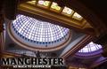
| 05/07/2003 08:24:17 PM | Manchester so much to answer forby PaulkComment: well, what has manchester done that it must answer for something? ;) lol
I like the blue and purple tones around each of the domes, it contrasts well with the yellowyness of the surrounding architecture. |  Photographer found comment helpful. Photographer found comment helpful. |
| 05/07/2003 08:23:09 PM | Bostonby svitalComment: I think I would have liked a little bit of text to make this feel more postcardy, but I applaud your subject choice and composition, its very unique! |
| 05/07/2003 08:22:17 PM | In a New York Momentby dimitriiComment: besides the motion blur, I don't really get the feeling of NY from this shot. Maybe the cab is supposed to do? Great idea though, and the choice of portrait layout does make the whole scene seem more rushed, like a NY minute. | | Photographer found comment helpful. |
| 05/07/2003 08:20:10 PM | Ryman Auditorium, Home of the Grand Ole Opryby DougPazComment: ooh..why the yellow text? it doesn't match with your photograph! This isn't the most dramatic angle on this building it would seem, and it all needs just a little something to make it "pop" as it were..perhaps if you moved to your right a little and got a slightly more head on view? :) Just an idea! |
| 05/07/2003 08:18:01 PM | Fargo, North Dakotaby alanfreedComment: Love the caption on your card! LOL Nice shot of ordinary life in what looks like a typical little town. The building is a little dark and the whole shot seems to suffer from a soft focus, but I like your choice of composition. :) | | Photographer found comment helpful. |
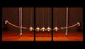
| 05/07/2003 06:55:06 PM | Newtonianby pinbackComment: Hello hello from the Critique Club, Andrew!
This was a super shot, though I have to disagree with some of the comments, I think you can make both end balls move out at the same time. I recall playing with one and if you pull out both end balls and drop them at the same time they both bounce back out with the middle balls not moving at all. :)
Onto the important stuff:
The shadows give it away that these are in fact three pictures, as Rob pointed out, so full marks for meeting the challenge.
Composition wise, I really like this shot and haven't got too many suggestions by way of critique for you, I hope you're not too disappointed! Someone mentioned the motion on the still strings of the "exterior" balls, and I really like that, adds to the kinetic/potential energy transfer theme!
First, its a bit grainy and appears perhaps oversharp? A subtle hand with a noise reducer would do wonders here, if you were so inclined.
I think the biggest area to play with is the lighting on the exterior balls. I can only really see half of each swinging ball while the rest is lost in shadow. I love the way the rest of it is lit, with the foreground lighter and the background fading to that deep red.
I think the heaviness of the top and bottom border unnecessarily even out your picture, I like the panorama feel a high aspect ratio would give on this shot, and would have loved to see you keep it that way with an even border all around.
Overall:great shot! You lined up these three images extremely well. I am left wondering if the right picture is only a mirror of the left? Something i hope you'll answer for us. Well done, and super placement in the challenge. | | Photographer found comment helpful. |
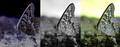
| 05/07/2003 06:39:22 PM | Photo-Evolutionby AnachroniteComment: Big Hellos from the Critique Club, Jeff!
Challenge: multi-image compositions
I don't think there is anything in the "rules" about it having to be different exposures, just multi-image, so I'd say you nailed the "meet the challenge" bit of the program.
Composition, colour and contrast: I like your angle and crop on the butterfly, and the inclusion of the ant adds loads of interest (though I can barely see him!)
I like the three different "stages" you've shown here. At first I thought it ought to be some sort of "from negative to positive" progression, and that may be what you meant, but it could also have been from what's on your camera (colour) to something unique in photoshop (the negative colours image). Either way, whether you look at it from left to right or right to left, I think you've captured a very neat idea about the "art" of photography. I would have done as mariomel suggested, and added a tiny border between and around the shots, even just 2 pixels in white to give it more defined separation.
As for colours and contrast... this is where I think we run into trouble. The colour photograph is muted, without enough colour range. All three suffer from brightness and contrast problems, most noticeable on the first two, and this hides the details, such as that brave little ant!
Focus and lighting: You've got a very shallow DOF and I would have preferred to see all of the butterfly's wings in focus because the pattern on the wings is so lovely. I suspect you took this picture outdoors, in which case i am going to guess you didn't use any special lights, but whatever nature provided at that time of day. So, maybe a longer shutter? Or some other method to get some more light in and grab more of the colours!
Overall: I love the idea, I like how you used a simple photograph to show off the "art" of photography. I think a little tweaking and some work on presentation and we'd hit jackpot. | | Photographer found comment helpful. |
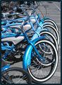
| 05/07/2003 04:41:23 PM | Rental Bikesby friscaComment: Thanks for the comments, everyone! I know that there has been a lot of discussion about the use of desaturation in photographs. It can be "gimmicky" but here I used it for a number of reasons.
1. the bike in front, which I should have moved!! (I didn't want to crop it out because of the other details I would lose with it) was RED. Yep. I had to change the hue significantly to get it to at least match the others since cropping it out would ruin the repetition of the bikes.
2. The flowers were ugly purple and got even uglier when I changed the red channel hue.
3. The pavement was boring and distracting with its faded yellow and white lines. I wanted the attention on the bikes, which is what caught my eye in the first place. I know now to move stuff out of the way to get the shot I want!
I desaturated all channels but blue and cyan which let me keep the chrome and silvers on the bikes. They pretty much look like that in real life too, but this way, I can control what my viewer is concentrating on, and that's why I desaturated. |
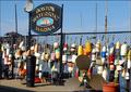
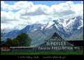
| 05/07/2003 04:10:25 PM | Good for what ails ya!by dsidwellComment: I like how the building mimics the shape of the mountains behind it, lovely composition, though the building is a bit darker than I would have liked. Probably because of the bright whites in the sky and mountains. | | Photographer found comment helpful. |
| 05/07/2003 04:09:17 PM | For Mother's Dayby myqylComment: beautiful building, and I like the activity you have captured around them. They look useful and a part of life still. Howeve, the shot seems a little dark and dull, and the building is in a big shadow that takes away from its beauty and detail. Maybe if you shot during a brighter day or did some post processing adjustments to brightness and contrast? :) | | Photographer found comment helpful. |
|
Showing 971 - 980 of ~1402 |
Home -
Challenges -
Community -
League -
Photos -
Cameras -
Lenses -
Learn -
Help -
Terms of Use -
Privacy -
Top ^
DPChallenge, and website content and design, Copyright © 2001-2026 Challenging Technologies, LLC.
All digital photo copyrights belong to the photographers and may not be used without permission.
Current Server Time: 04/29/2026 03:35:55 PM EDT.
|