DPChallenge: A Digital Photography Contest You are not logged in. (log in or register
 
Browse Settings
Currently viewing:
Memberfrisca

Show comments:

Per page:

Order:

Comments:


Comments Made by frisca
Pages:   ... [94] [95] [96] [97] [98] [99] [100] ... [141]
Showing 961 - 970 of ~1402
Image Comment
Mobil Pegasus
05/08/2003 01:53:26 PM
Mobil Pegasus
by cmrk74

Comment:
Its a great idea to use those pretty buildings to frame the pegasus, but its just too small and crowded by the buildings to stand out as much as it should.
Photographer found comment helpful.
Work Tools
05/08/2003 12:42:52 PM
Work Tools
by wsargen

Comment:
Hello from the Critique Club, wsargen!

I looked up your profile and see your name listed as "Winthrop" but after looking at your multi-image composition, I think I should just call you "officer, sir". ;)

Onto the meaty stuff:

Challenge: multi-image composition

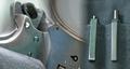
At first blush, I thought this was one strange image, but after looking for a few more seconds, its obviously 3, though I was too naive to know what the gun was without reading the comments below! You met the challenge requirements for sure!

Composition, contrast, colour:The 3 C's.

I looked quite carefully at the first picture, and it looks like its the back of the gun, just at the top of the handle. Lots of people knew what it was, but since I had a bit of trouble, i wonder if the image might have been more powerful if you pulled back a bit and got more of the gun in the shot? perhaps some of the handle, or barrel or even the trigger? Just a thought on that one. I LOVE the angle you have on the handcuffs, I think its just perfect, with great focus. The only think I'd change is maybe a more contrasting background, perhaps a starker white behind the cuffs? An idea to ponder anyway.

Now the pens.. I'm divided about them. As someone suggested, a badge or nightstick might have been more dramatic, if not a little more cliche. The pens are certainly the tool you use most often I'm sure, and since you chose them, I'm going to assume that you wanted the message they convey about the more "routine" things cops do. Maybe a ticketbook would have been a better choice for the 3rd shot? I hate messing with artistic choices, but if you post why you chose the pens, that might settle all of our minds. :) Nitpick: the lint and dust specs on the pens shot and the gun shot.

I love this blending effect, but the problem is that we have to concentrate pretty hard to see that its three different images, and that really mutes the impact of your triptych. I don't like the idea of clear borders between them, but maybe a bit more whitespace, like each photo fading a bit more to white and then blending them together so there is that gap between shots. I also think the addition of the white will help bring out the cold metal grey tones you have here, since each picture is very similarly coloured.

focus and lighting: You have captured wonderful detail and focus on all the pictures. Besides a brighter background behind the cuffs, I think you've lit these well, allowing us to see the detail without any harsh reflections or bright spots off the metal.

Overall: This is a great picture and a very unique blending effect. With a little bit of whitespace between, you'd really punch this up and have a dramatic effect! I quite like it in any event, well done!
Photographer found comment helpful.
Jefferson Memorial
05/08/2003 01:33:20 AM
Jefferson Memorial
by magnetic9999

Comment:
magnficient and uncluttered by your text. What gorgeous composition lighting and focus and textures!
Photographer found comment helpful.
Windy City
05/08/2003 01:27:55 AM
Windy City3rd Place
by pitsaman

Comment:
beautiful geometry and colours. I think you shot this at the just the right time of day to capture a lighter blue sky and the lights as well. well done!
Photographer found comment helpful.
A friendly greeting from Copenhagen!
05/08/2003 01:25:48 AM
A friendly greeting from Copenhagen!
by pollonos

Comment:
super composition! the line of boats and buildings are just perfect. but..overexposed/too bright, and in the end, the shot seems a bit harsh and perhaps even too sharp. Was there a lot of post-processing done?
Photographer found comment helpful.
The Old Mill
05/08/2003 01:23:49 AM
The Old Mill
by boyte1

Comment:
I like that you kept more of the creek to give yourself space to write the text, but the font and colour don't stand out enough from the water, and the tall leaves/grass distract from the quaintness of the mill.
Gateway to the West
05/08/2003 01:22:02 AM
Gateway to the West
by kaysriv

Comment:
great angle on an oft photographed landmark. :) I love the consistent blue tones as well. My only gripe is the font..its not adding anything to the style of your photo..still a great shot though!
glass
05/07/2003 09:01:07 PM
glass
by Becky

Comment:
sadly, this is wildly out of focus, and it seems too poorly lit to capture the details of the glass.
Magnifying Picasso
05/07/2003 09:00:25 PM
Magnifying Picasso
by kosmikkreeper

Comment:
I adore this composition..what a great interpretation of glass! I can see all your model's pores though..and stubble! lol good choice of colour too, gives it a real abstract feel. 9
Photographer found comment helpful.
Walk on the Ocean Floor
05/07/2003 08:44:29 PM
Walk on the Ocean Floor
by KimInNB

Comment:
certainly a crisp, picture postcard day! Why did you choose to leave off any text? Borders are not necessary either to make a good postcard, but often add a lot in terms of finishing and polish. :)
Photographer found comment helpful.
Pages:   ... [94] [95] [96] [97] [98] [99] [100] ... [141]
Showing 961 - 970 of ~1402


Home - Challenges - Community - League - Photos - Cameras - Lenses - Learn - Help - Terms of Use - Privacy - Top ^
DPChallenge, and website content and design, Copyright © 2001-2025 Challenging Technologies, LLC.
All digital photo copyrights belong to the photographers and may not be used without permission.
Current Server Time: 09/09/2025 02:35:28 PM EDT.