|
|
|
Showing 831 - 840 of ~1402 |
| Image |
Comment |
| 05/22/2003 11:17:07 PM | |  Photographer found comment helpful. Photographer found comment helpful. |
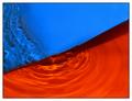
| 05/21/2003 12:03:41 AM | Orange Blossomby friscaComment: I wanted to make this look like a sunrise, so I left the glare in. Live and learn! :) I will put a version up without the glare in my portfolio. Thanks to all who commented, I really appreciate all your help and time commenting! |
| 05/20/2003 11:58:46 PM | |
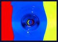
| 05/20/2003 10:58:49 PM | An Eye For Primary Colorsby CLarson557Comment: Greetings from the Critique Club, Connie!
This is a really neat shot that I hadn't figured out during the challenge, so I really appreciate your comments accompanying the shot.
Colour, Composition, Contrast:
I like the colours a lot on this one, they are bright and saturated. :) My gripe is the way they are strangely blending together at the seams with those weird artifacts. That might be due to the compression, and someone suggested to me that I work on pictures in tiff and then save them as jpeg once done (works even if you took the picture in tiff!) Might also be your computer screen, in which case...still do the tiff trick, it WORKS! :) The arrangement of colours is just perfect.
This is a really neat composition and an interesting abstract. It does look like the colours are going down the drain, and I think that is what really makes this picture pop.
Focus and Lighting:
The focus seems a shade soft, but its not a fatal flaw. The colours are nice and bright and there are no weird shadows, so I'd say well done on all accounts.
Overall:
This is a great idea and an unique picture with great results. Its interesting and bright and at least well deserving of its score and placement! Happy shooting! | | Photographer found comment helpful. |
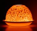
| 05/20/2003 10:31:12 PM | Hand Painted Fenton Glass Vaseby DougPazComment: Greetings again from the Critique Club, Doug!
I believe this is my third time critiquing one of your pictures...either you're priviledged or you are cursed! :) I hope you find this helpful in any event.
Colour, Composition and Contrast:
Glass is inherently a difficult subject to photograph, but I like this vase a lot. You've chosen to centre the composition, which isn't normally my first choice, just out of fear of losing interest in the viewer. However, I think it works for this vase because of the way the flowers are painted on it. I like your choice of a neutral background, but I'm not sure I like the texture, I think it detracts from the elegance of the vase. This is only a minor point though.
I would have liked more of the other colours in the vase to be prominent though, maybe a longer exposure as autool suggested?
Focus and lighting:
I adore the way this is lit. I think the glow through the vase and illumination of the flowers is lovely. The light is in the centre, allowing the top and bottom of the frame to be a bit darker, which is a very pleasing effect. The focus throughout is very good, with all the edges of the glass clear.
Overall:
I think you did a very good job with this vase. I'm struggling to figure out why you placed as you did, but I think it was just a plain lack of "oomph" in the shot. Its very nicely done, and technically good, but the subject just lacked that little something that grabs the attention of the voter. But I have to say, you've done well with this, and keep up the good work! :) |
| 05/20/2003 08:38:37 PM | Limogeby BarbComment: focus is soft, but I really like the warm glow and dark edges. | | Photographer found comment helpful. |
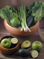
| 05/20/2003 08:33:04 PM | Eat Your Fruits And Veggiesby wayne9232Comment: there seems to be a haze over this whole picture. Maybe playing a bit with the levels will boost the brightness and contrast and get ride of that whitish cast? | | Photographer found comment helpful. |
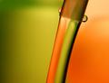
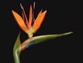
| 05/20/2003 08:31:34 PM | Bird of Paradiseby GalinaComment: these are my favourite flower. Nicely done. The green needs a bit of a "boost" though..it seems washed out some. | | Photographer found comment helpful. |
| 05/20/2003 08:30:10 PM | | | Photographer found comment helpful. |
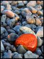
| 05/20/2003 08:29:32 PM | The Sunset Stoneby moondoggieComment: I like the colours here, maybe try a crop of some of the top stones...there seems to be a bit too much background to really keep attention on the big orange rock. :) | | Photographer found comment helpful. |
|
Showing 831 - 840 of ~1402 |
Home -
Challenges -
Community -
League -
Photos -
Cameras -
Lenses -
Learn -
Help -
Terms of Use -
Privacy -
Top ^
DPChallenge, and website content and design, Copyright © 2001-2026 Challenging Technologies, LLC.
All digital photo copyrights belong to the photographers and may not be used without permission.
Current Server Time: 05/01/2026 09:51:19 AM EDT.
|