| Image |
Comment |
| 06/16/2003 01:34:01 PM |
Publishers Monthly: "Author of the Year"by sfarrell23Comment: this has a comic book feel to it from the colours of all these softcovers. I don't know this author, but I'm guessing these are popular books! I think the frame is a little too full for a magazine cover. |
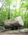
| 06/16/2003 01:32:47 PM |
Geotimesby MarkS224Comment: I like this, though I think the whiteness of the sky is a bit too bright and harsh. The light on the rocks is very nice. A crop would fix it up nicely! :) |
 Photographer found comment helpful. Photographer found comment helpful. |
| 06/16/2003 10:56:09 AM |
Skid Finby timj351Comment: crazy and trippy tilt! I wish the yellow of the boat was more saturated though, its getting a bit lost in the splash, especially with those shadows. |
| 06/16/2003 10:54:59 AM |
Vogueby danh669Comment: I think the cropping required for this shot to work as a magazine cover would really mess with your composition, not that a crop that was just her head would not look nice, but it would be totally different than what you have taken. I like the light on her face, but wish for a greater DOF for this shot to really pop. :) |
| Photographer found comment helpful. |
| 06/16/2003 10:53:19 AM |
Sports Illustrated Swimsuit Editionby AleciaComment: very beautiful model, but the lighting was not in your favour in this shot. She is not well lit up and the ocean looks washed out (no pun intended) without very much colour. |
| Photographer found comment helpful. |
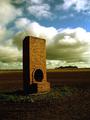
| 06/16/2003 10:50:30 AM |
Rural Australiaby Girl from OZComment: a bit dark, but I like the golden light on the structure, its very nicely done, and I like the composition with the clouds in the back. |
| Photographer found comment helpful. |
| 06/16/2003 10:46:04 AM |
Teddy Bears and Friendsby DoorskidderComment: I think a warmer light would have helped this shot, it seems a bit flat and not warm and fuzzy,which would go with the composition. |
| Photographer found comment helpful. |
| 06/15/2003 07:54:26 PM |
Transparent Programby amonteforteComment: that is TOTALLY wild. My mind is bent trying to figure out how you did that. Its a bit dark, but such a neat idea, I can't pass it up. |
| 06/15/2003 07:48:09 PM |
Peaksby jgal76Comment: reminds me of the sun setting on a mountain range. Very creative. I like the colours, though I wish there was more contrast between the wood colour and the paint of the pencils. |
| Photographer found comment helpful. |
| 06/15/2003 07:31:17 PM |
|
| Photographer found comment helpful. |
Home -
Challenges -
Community -
League -
Photos -
Cameras -
Lenses -
Learn -
Help -
Terms of Use -
Privacy -
Top ^
DPChallenge, and website content and design, Copyright © 2001-2026 Challenging Technologies, LLC.
All digital photo copyrights belong to the photographers and may not be used without permission.
Current Server Time: 04/29/2026 05:09:54 PM EDT.