| Image |
Comment |
| 06/16/2003 03:39:53 PM |
guitaristby deceptiveComment: I could see this on a cover. Subtle composition with nice colouring and I like the grain..adds a lot of character. |
 Photographer found comment helpful. Photographer found comment helpful. |
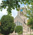
| 06/16/2003 03:36:13 PM |
The Church Timesby hughletherenComment: your framing of this church is really nice, the focus seems odd on the bushes, but no big deal. However, I seem to detect a white cast/haze over everything though. Maybe a levels adjustment? Just an idea! :) |
| Photographer found comment helpful. |
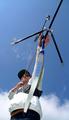
| 06/16/2003 03:26:36 PM |
The Glade (www.theglade.co.uk)by paynekjComment: I think I would have liked to see the end of the arrow (or whatever is at the end there). Pretty wicked perspective makes this guy look HUGE. I like the brightness and light in the shot as well, it is very nice and clear. |
| 06/16/2003 03:12:17 PM |
Runners worldby kengurinnComment: very good shot. Needs a tiny brightness boost to make it pop, but great action, and love your composition. The lines are awesome and the intense face of the hurdler is awesome. |
| Photographer found comment helpful. |
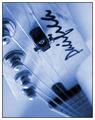
| 06/16/2003 03:10:05 PM |
Photoworld Magazine: Is digital taking over?by auiComment: great DOF, I wish there was a little more colour going on though, or maybe its just the heaviness of the border, which I think really takes it away from what ought to be an a magazine cover. |
| Photographer found comment helpful. |
| 06/16/2003 03:07:54 PM |
PC-Worldby zeranicoComment: the foreground blur is too indistinct to make this effective as a cover. I like the smokiness though and the blue tones though, very industrial/tech feel. |
| Photographer found comment helpful. |
| 06/16/2003 03:07:02 PM |
Playboatingby vjozComment: white balance seems a bit on the bluish side...the skin tones are purple, though perhaps he is exerting himself quite a bit! lol Nice tilt, though, I think it really makes the shot very action packed and cool! |
| Photographer found comment helpful. |
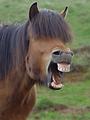
| 06/16/2003 02:22:57 PM |
Horse Illustratedby eikidigiComment: what a fortuitous capture! I love the framing and the laugh. I don't know anything about this magazine, but it would be fun to see it on the cover. |
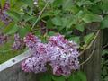
| 06/16/2003 02:21:59 PM |
Country Gardening And Landscapesby djmskiComment: nice compositioni with the lilacs over the fence. I would also have bumped the brightness and saturatioin on this to get a real magazine cover feel to it. |
| Photographer found comment helpful. |
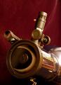
| 06/16/2003 01:51:05 PM |
Sky & Telescope ~ Eclipse of Sunby ladpupmoeComment: i like the reflection in the end of the lens. Very nice. Wish there was a bit more light though, for some reason it seems a tad too dark, or maybe its just not enough contrast? I'm not sure..I'm struggling to find what my hesitation is here. |
| Photographer found comment helpful. |
Home -
Challenges -
Community -
League -
Photos -
Cameras -
Lenses -
Learn -
Help -
Terms of Use -
Privacy -
Top ^
DPChallenge, and website content and design, Copyright © 2001-2026 Challenging Technologies, LLC.
All digital photo copyrights belong to the photographers and may not be used without permission.
Current Server Time: 04/28/2026 05:50:36 PM EDT.