|
|
|
Showing 321 - 330 of ~1402 |
| Image |
Comment |
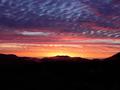
| 10/02/2003 09:01:32 PM | Labrador Dawn.jpgby orussellComment: ah..beautiful! I want to get out to labrador! I hope you get some shots of the northern lights too. |  Photographer found comment helpful. Photographer found comment helpful. |
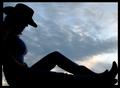
| 10/01/2003 12:08:00 AM | Cowgirl at Sunset by Firstrich1Comment: wow. This is excellent! Congratulations on your ribbon, there is hardly a thing I'd want different about this shot except maybe a little more colour in the sky (but that's a nit!) | | Photographer found comment helpful. |
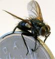
| 09/29/2003 12:09:59 AM | Bug and Coin by JackoComment: way to ribbon mr. cliche! :) I personally really like coin macros. | | Photographer found comment helpful. |
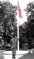
| 09/24/2003 10:12:52 PM | Support & Defendby A WeaverComment: Hi Aubrey! Greetings from the Critique Club!
A very touching shot that I'm happy to offer some extra comments on.
Colour, Composition, Contrast:
Here is where I think the shot lost a lot of potential impact. I don't mind the "from behind" view because it gives that solider any "any GI" sort of feel, like we could all know him as a cousin, brother, son, etc. However, that sky..my my, its got to go! a pure white sky never ever looked great, and here, its just overpowering the shot, blending in with the flag pool and generally messing with the colours of the shot. The rest of the colours seem very muted. I get the feeling you may have desaturated all channels but the red and blue a little to make the flag stick out more..which is a great idea, and has its own impact, but as its not entirely clear that you did indeed do that, either it needs to be done more or in a different way. The flag certainly does stick out though. What is odd to me is that there is colour in his clothes, but not in the grass, it just makes the shot seem a unnatural in an odd way. And it makes our solider blend in with the trees, which mutes the impact.
I disgree with the comments that this less freedom than it is patriotism. While saluting a flag is very patriotic, being an American flag, the shot says to me "these guys fight for freedom" at least in principle. (i'm a bit of a cynic when it comes to politics, but I don't fault the soliders for where they are deployed and ordered to fight, etc).
Focus and lighting: Most of my comments above cover what I think for these two areas. I have no problems with the focus, certainly a different DOF may have been employed, but what you have done is beyond reproach, and I think it works fine. The light... oye, again with the very bright white sky, it completely dominates the shot and takes away from its message.
Hope these comments help you! Happy shooting!
Pam | | Photographer found comment helpful. |
| 09/24/2003 08:57:12 PM | Big Boy's Don't Cryby OneSweetSinComment: I read your thread about lack of CCs and so I figured I ought to go do one, and LOOK I got yours! What a co-incidence!
Anyway, onto business. Here's your critique club comment!
Color, composition, contrast: Two things I noticed right away about this shot: there is too much tree unnecessarily and it places the boy in the centre of the frame which makes the whole thing seem very static. A crop of a portion of the tree would move the frame over and give it a little more pleasing presentation. Also, the colouring just isn't doing it for me. I think colour shots are wonderful and emotive, but I don't think this shot in colour is doing it justice. A black and white version I think would really play up on the message and the wonderful expression you captured in very basic contrast and I think that would work best.
Another reason this may not have gotten the reaction you were hoping for is that we can't really connect with our subject as his eyes are too far away from the camera. We barely get a sideview, and that hurts the viewer's ability to connect with your subject.
Focus and Lighting:I like how the background is blurred, that helps keep the shot uncluttered. And the focus on your subject is without fault. However, I think there is too much light on his face, and that is throwing off the shot somewhat.
I hope that helps! :) cheers.
Pam | | Photographer found comment helpful. |
| 09/24/2003 02:18:40 PM | Boys On The Blockby Ruud VermeijComment: I totally agree with what bob said. It reminded me of what the trainspotting guys might have looked like as youth. Really awesome shot. A wee bit underrated. |
| 09/23/2003 08:12:25 PM | | | Photographer found comment helpful. |
| 09/23/2003 08:04:54 PM | Life is a thorny chain...by deadbrainComment: love the shot. Think its more metaphorically on topic that literally, but that's of little consequence. very creative use of DOF. |
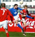
| 09/22/2003 12:08:27 AM | Soccer by arnitComment: i knew this was you, arnit! :) Beautiful colour and perfect action! congratulations! |
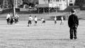
| 09/22/2003 12:04:17 AM | Can I Play Too?by vonautschComment: I really loved the look and feel of this shot, I'm so glad you placed well! Its not what you typically think of when you are told "action of sports" but it says so much more, that I can't help but be drawn to it. | | Photographer found comment helpful. |
|
Showing 321 - 330 of ~1402 |
Home -
Challenges -
Community -
League -
Photos -
Cameras -
Lenses -
Learn -
Help -
Terms of Use -
Privacy -
Top ^
DPChallenge, and website content and design, Copyright © 2001-2026 Challenging Technologies, LLC.
All digital photo copyrights belong to the photographers and may not be used without permission.
Current Server Time: 04/28/2026 05:00:20 AM EDT.
|