I read your thread about lack of CCs and so I figured I ought to go do one, and LOOK I got yours! What a co-incidence!
Anyway, onto business. Here's your critique club comment!
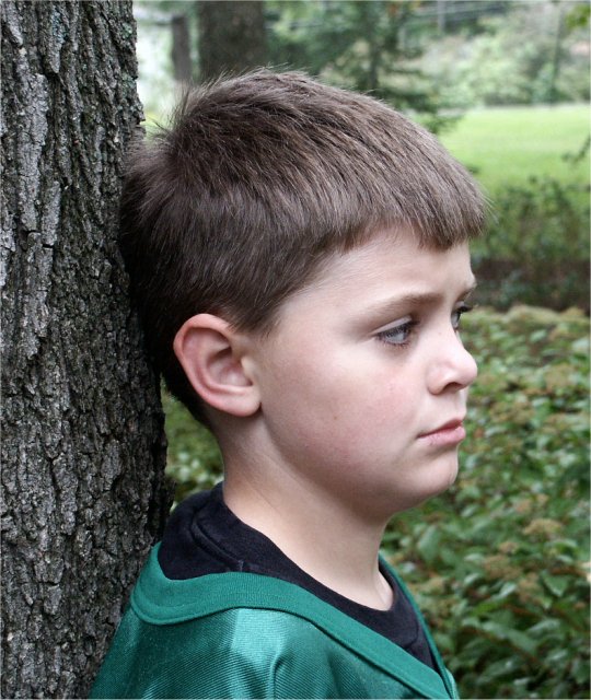
Color, composition, contrast: Two things I noticed right away about this shot: there is too much tree unnecessarily and it places the boy in the centre of the frame which makes the whole thing seem very static. A crop of a portion of the tree would move the frame over and give it a little more pleasing presentation. Also, the colouring just isn't doing it for me. I think colour shots are wonderful and emotive, but I don't think this shot in colour is doing it justice. A black and white version I think would really play up on the message and the wonderful expression you captured in very basic contrast and I think that would work best.
Another reason this may not have gotten the reaction you were hoping for is that we can't really connect with our subject as his eyes are too far away from the camera. We barely get a sideview, and that hurts the viewer's ability to connect with your subject.
Focus and Lighting:I like how the background is blurred, that helps keep the shot uncluttered. And the focus on your subject is without fault. However, I think there is too much light on his face, and that is throwing off the shot somewhat.
I hope that helps! :) cheers.
Pam |