| Image |
Comment |
| 08/24/2004 05:24:46 PM |
Odalisqueby JesuispeureComment: this looks like a renaissance painting. I love the soft treatment. I probably would have had her take out her nosepin though, seems out of place. very nicely done. |
 Photographer found comment helpful. Photographer found comment helpful. |
| 08/24/2004 05:20:20 PM |
Scarred Beautyby lagavulinComment: i think it could have benefitted from a bit more lighting. its dark around her face and makes the whole image seem underexposed. |
| Photographer found comment helpful. |
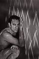
| 08/24/2004 05:19:26 PM |
Naked Thoughtsby ChezComment: your model has the face of a classic actor from the 40s. Pose is a bit odd, but overall I like the expression on his face and the strange wall he's supporting himself with. |
| Photographer found comment helpful. |
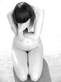
| 08/24/2004 05:16:09 PM |
Ashamedby KonadorComment: brilliant use of negative space and I like the shape created by the form. Very emotive and suggestive of a greater story. |
| Photographer found comment helpful. |
| 08/24/2004 04:54:03 PM |
eternal desireby theodor38Comment: i like this composition, but the crop seems a bit crooked and I wish there was a bit more light on his hands and arms -- they appear very strong, expressive and beautifully shaped. |
| 08/24/2004 04:48:55 PM |
Serenity by grigrigirlComment: wow, that's lovely. my first 10 of the lot. She is shaped like a classic sculpture, and what brilliant lighting. I couldn't offer one word of improvement. |
| Photographer found comment helpful. |
| 08/24/2004 04:46:07 PM |
aloneby brunasComment: i think that the lighting coming from behind her shoulders is too much as it washes out the shoulders, which interferes with the emotion of the image. Otherwise I like the bw work in the high(er) key area. |
| Photographer found comment helpful. |
| 08/24/2004 04:43:42 PM |
The Two Towersby BassieComment: cool concept and very athletic model. I think I would have preferred it without the hat though. Seems to infere with the image. |
| Photographer found comment helpful. |
| 08/24/2004 04:41:21 PM |
Self-Censoredby annasenseComment: I love this, but I think there should have been another inch of the sign showing after the "T". Also.. I don't mind the grain, but the image is a bit softer than i would have done. Such a stark and honest shot needs a bit more sharpness, especially to go with the grain/noise. |
| Photographer found comment helpful. |
| 08/24/2004 02:47:44 PM |
Red Lingerieby DrJOnesComment: oh good doctor! :) I love the green bg against the red hair and lingerie. Not keen on the water, makes it look like she's got hives on her boob, but otherwise a fantastic entry! Love the selective sort of lighting. its great! |
| Photographer found comment helpful. |
Home -
Challenges -
Community -
League -
Photos -
Cameras -
Lenses -
Learn -
Help -
Terms of Use -
Privacy -
Top ^
DPChallenge, and website content and design, Copyright © 2001-2026 Challenging Technologies, LLC.
All digital photo copyrights belong to the photographers and may not be used without permission.
Current Server Time: 04/27/2026 03:56:25 AM EDT.