| Author | Thread |
|
|
07/06/2006 08:44:32 AM |
|
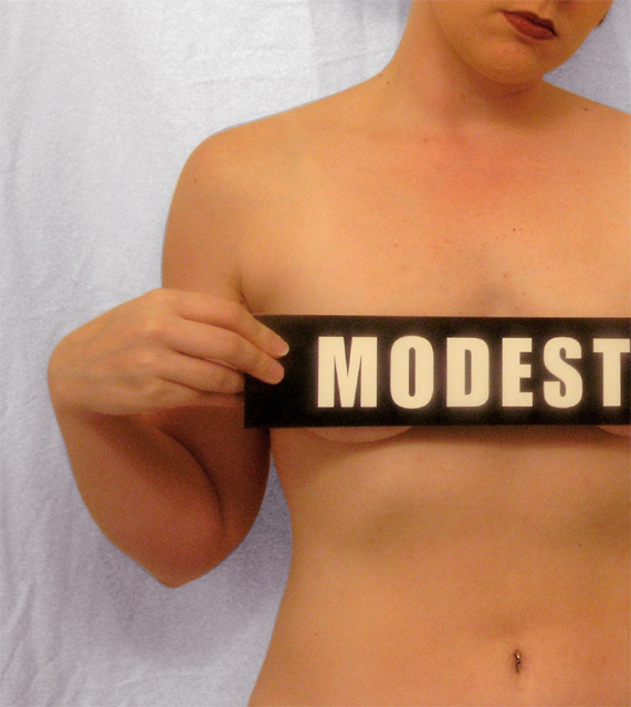
I'm kinda suprised this didn't do better (wait... where am I again, no I'm not). Let me rephrase that, It should have done better. It's a nice shot with a superb crop. I think if it we're cropped any other way it wouldn't have been as strong. Wether it was on purpose or not... I like the overall noise and the wrinkles in the background. |
|
 Photographer found comment helpful. Photographer found comment helpful. |
|
|
10/07/2004 10:48:24 PM |
nevermind
Message edited by author 2006-06-25 16:40:09. |
|
|
|
09/27/2004 03:10:50 PM |
I don't quite see how this is much of a political statement or much of a social statement. If you had perhaps held the 'Modest(y)' sign vertically to the left of the photo, revealing it all, so to speak, the shot, in my opinion, would take on a greater political and or social commentary meaning.
As it stands, the image provides little more then a statement of the American Status Quo. It is an affirmation of that which already exists in American Society. There is no challenge to my American values in this image.
That being said, the image is quite nicely captured and post processed. Based on the 'Nude II' topic challenge, I personally would have scored this a 9. I really like that amount that has been captured in the image, the slight tilt of your head, the slight grain to the image, the background. To me, it is a very well composed image.
I like this image. |
|
| Photographer found comment helpful. |
|
|
09/10/2004 08:46:38 PM |
|
| Photographer found comment helpful. |
|
|
08/30/2004 05:16:31 PM |
This was one of my 2 top picks in this competition...
A shame that it did not score higher. Why must nude always be so nude.
I like this one very mutch!
Great photo! |
|
| Photographer found comment helpful. |
Comments Made During the Challenge  |
|
|
08/29/2004 05:59:30 PM |
|
I think this turned out really well. The crop is about perfect and the concept is interesting. Nice work. |
|
| Photographer found comment helpful. |
|
|
08/28/2004 11:20:40 AM |
|
| Photographer found comment helpful. |
|
|
08/27/2004 03:20:08 PM |
|
Clever picture, nice flesh tones and lighting. |
|
| Photographer found comment helpful. |
|
|
08/26/2004 01:44:47 PM |
|
Very cute idea and good composition, just wish the background wasn't so distracting (I'd much prefer it totally out of focus, and maybe black) |
|
| Photographer found comment helpful. |
|
|
08/26/2004 01:55:49 AM |
|
| Photographer found comment helpful. |
|
|
08/26/2004 12:15:17 AM |
|
| Photographer found comment helpful. |
|
|
08/25/2004 08:32:13 PM |
Great cut and good lightning, looks like a homemade studio!
|
|
| Photographer found comment helpful. |
|
|
08/25/2004 01:01:57 PM |
|
if you'd moved her away from the background more you might have been able to loose the wrinkles and the shadow in the back drop. |
|
| Photographer found comment helpful. |
|
|
08/25/2004 09:07:45 AM |
|
Too bad about that background since the idea is great |
|
| Photographer found comment helpful. |
|
|
08/24/2004 10:07:03 PM |
|
great take on the challenge, I wonder if a more centered comp would be better. I feel my eye is drawn to the upper left bright area. Perhaps on a darker background. Good job |
|
| Photographer found comment helpful. |
|
|
08/24/2004 09:07:06 PM |
|
This is a very nice image - the "modest" sign seems funny at first, but the expression of the lips makes it serious. Overall it comes across as very honest and real - great job! (9) |
|
| Photographer found comment helpful. |
|
|
08/24/2004 04:45:11 PM |
|
I like this idea. I also like that I can see the little ring in the belly button and the pretty painted lips. Nice details. Image is too soft for my tastes and background lets it down a touch for me. |
|
| Photographer found comment helpful. |
|
|
08/24/2004 04:41:21 PM |
|
I love this, but I think there should have been another inch of the sign showing after the "T". Also.. I don't mind the grain, but the image is a bit softer than i would have done. Such a stark and honest shot needs a bit more sharpness, especially to go with the grain/noise. |
|
| Photographer found comment helpful. |
|
|
08/23/2004 11:23:55 PM |
|
Like the sign, almost appears as a self portrait that was cropped. could be a bit more balanced, overall really good. 9 |
|
| Photographer found comment helpful. |
|
|
08/23/2004 10:01:42 PM |
|
The arm position is tremendous. I'd cover the belly ring if she is going to hold a modest sign, IMO the ring is not the biggest sign of chastity. or modesty. Its a bit too soft for my taste too. |
|
| Photographer found comment helpful. |
|
|
08/23/2004 02:48:58 PM |
|
Cute idea and done well. Some noise and the background needs ironing. Good job and I like your idea very much. |
|
| Photographer found comment helpful. |
|
|
08/23/2004 02:00:54 PM |
|
| Photographer found comment helpful. |
|
|
08/23/2004 11:08:31 AM |
|
Interesting shot, background is a little too distracting for me. The skin tone could have done with some NeatImage to smooth out the textures a little, the current lighting is not very flattering and highlights blotchy areas and veins. Nice composition, I particularly like the inclusion of the model's mouth. |
|
| Photographer found comment helpful. |
|
|
08/23/2004 10:37:55 AM |
|
Yes, she is. Great response to the challenge, and very nice photo. I like the grain, it gives the whole photo a soft feel and correlates with her modesty. Very visually striking entry! |
|
| Photographer found comment helpful. |
|
|
08/23/2004 09:54:08 AM |
|
Background could ne improved, but like the idea |
|
| Photographer found comment helpful. |
|
|
08/23/2004 05:49:20 AM |
|
Fun, I love it. Very nicely executed, even if it has hidden the rather lovely model *laugh* Nice work. |
|
| Photographer found comment helpful. |
|
|
08/23/2004 04:21:21 AM |
I really like your idea here - very much indeed!
Kind of punky, rorcky type idea which works very well. But i think the execution has let it down - the white sheet I feel should eb pure white, as it is it looks like a bed sheet which really hinders a photographan nd gives it a real amature feel.
Perhaps in black and white with some more contrast would help it. |
|
| Photographer found comment helpful. |
|
|
08/23/2004 12:43:34 AM |
|
| Photographer found comment helpful. |
|
|
08/23/2004 12:16:24 AM |
|
A bit grainy and the white balance seems off. |
|
| Photographer found comment helpful. |
Home -
Challenges -
Community -
League -
Photos -
Cameras -
Lenses -
Learn -
Help -
Terms of Use -
Privacy -
Top ^
DPChallenge, and website content and design, Copyright © 2001-2026 Challenging Technologies, LLC.
All digital photo copyrights belong to the photographers and may not be used without permission.
Current Server Time: 06/28/2026 10:32:15 PM EDT.