|
|
| Image |
Comment |
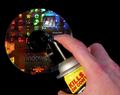
| 11/24/2003 04:44:16 AM | Software Debuggingby NeilComment: Greetings from the Critique Club.
Great concept and interesting take on the literalism challenge. I like the composition…the hand enters the image in the lower right hand corner and leads our eye to the bug spray, then to the CD, good work! The colors on the CD are very vibrant and pleasing to the eye, while the colors on the hand and can are about as realistic as you can get. The exposure is just right, I have a feeling that lighting the CD, bug spray and hand weren’t an easy task.
About the only things that I can think of that I can think of for improvement have already been mentioned.
Quadrajet
|  Photographer found comment helpful. Photographer found comment helpful. |
| 11/24/2003 04:33:56 AM | You Can Lead a Horse to Water.....by vtruanComment: Greetings from the Critique Club.
Great challenge concept, this is a very unique idea.
I like the poses of all three horses (individually), but they don’t seem to work together visually. To my eye, the image is quite busy. I feel that one or even two horses would have made a great subject, but three seems a bit like visual overkill.
The composition of this photo feels a touch claustrophobic to me, as if the right side of the shot was cropped a bit too tightly. I feel that more room on the right would help open this shot up and give it a touch more visual stability.
Black and white was an ok choice for this, but I wonder what the color image looked like. Like someone mentioned previously, the horse in the foreground seems a bit overexposed and its color is probably fairly washed out. Did you try shooting this with a faster shutter speed or smaller aperture?
I hope this helps,
Quadrajet
| | Photographer found comment helpful. |
| 11/24/2003 03:55:15 AM | Six of One, Half-Dozen of the Other (or Am I Comparing Apples and Oranges?)by TooCoolComment: Greetings from the Critique Club.
Excellent idea for this challenge, it really works well.
The lighting on this shot very soft, exactly what a person needs when shooting fruit like this. The thing that I find missing with the lighting is depth. The top and front of the fruit is illuminated perfectly; but, for food images such as this one, I find that lighting from above and slightly behind helps to add more dimension to round fruits. Lighting from above and slightly behind keeps the hot spots (not that yours are bad) to a minimum and gives the bottom of the fruit a bit of light causing a slight silhouette effect. I suggest playing around with it (if you want to) and you’ll see what I mean.
The composition is pretty straightforward. I don’t know what you could have done to improve it, but it leaves me a bit flat.
I hope this helps,
Quadrajet
| | Photographer found comment helpful. |
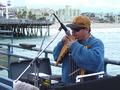
| 11/24/2003 03:32:17 AM | Time to Pay the Piperby StevePaxComment: Greetings from the Critique Club.
I like this idea for the challenge. My thought on the subject is…it doesn’t necessarily convey the idea of actually “paying” the piper. Maybe for this, a “tip jar” in front of him or maybe him looking at the camera, holding his hand out would help convey “paying” a bit better. Then again maybe I'm just being one of those "rule mongers" :). Of course either of these ideas would entail you interrupting his playing and possibly the whole event, so I suppose they aren’t viable options. I think you did well with what you had to work with.
Your exposure looks very good, considering the sky looks pretty overcast, unfortunately this results in fairly flat lighting (as was mentioned below). About the only thing that I can think of that could help in this situation would be a polarizing filter or an off camera flash illuminating him a bit from the left.
As far as composition goes, I like that you included the microphone stand in the shot. I have to say that the camera angle (height) is rather ordinary and doesn’t help give the subject an “interesting” look. Getting a bit lower (possibly just below eye level) might help make this shot more dynamic and the subject more interesting.
I feel I should mention the background. The background is almost an image in itself, and although that isn’t a bad thing, the subject is the piper. To my eye, the pier, sand and buildings detract from the shot. Not only do they add more for us to look at, they visually intersect his head. A different take on this shot may have been to shoot the piper from the same angle, but from the other side, with the water/sky as a backdrop. This could help keep him as the focus of the image as well as making him stand out even more than he does here.
I hope this helps,
Quadrajet
| | Photographer found comment helpful. |
| 11/23/2003 11:31:01 PM | |
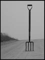
| 11/23/2003 11:28:09 PM | Look for the fork in the road!by ColeyComment: I really like the starkness of this shot. The vertical format works very well, as does the idea behind the image. Excellent fit to a great shot! | | Photographer found comment helpful. |
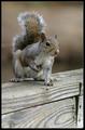
| 11/23/2003 11:27:13 PM | You're Nutsby jmsetzlerComment: Ahhh Setz...bucking the "cute kitten" trend eh? Are squirrels becoming "cliche" here at DPC? Not in this case ;-). This shot takes a run of the mill squirrel type shot to another level AND fits the challenge perfectly. Of course the spectacular composition and stellar sharpness of the image go without saying. Nice work! |
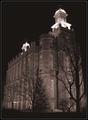
| 11/19/2003 08:41:33 PM | The Holy Templeby pncowleyComment: Greetings, from the Critique Club.
This image has an elegance to it that doesn’t immediately jump out at the viewer. A person has to actually LOOK at this shot to appreciate the delicate balance between light, aperture and shutter speed.
I like how the bell towers/steeples stand out against the night sky…also the tree silhouetted against the light on the building is a very subtle touch. The visual flow of this shot is great. My eye starts with the tree on the right…goes up to the steeple and follows the roofline to the other steeple…then down the back of the building. By the way, great job of handholding this shot, the lack of sharpness doesn’t bother me a bit.
I think your exposure is almost perfect; although, I feel there are a couple of overexposed points in the bell towers/steeples and the darkness/blacks are a touch grey. Of course, if you were to stop down any more, you’d lose the details in the building, so yup…there’s some give and take with a shot like this. Another thing to note…I have my monitor set a touch bright in order to see details in images with a lot of darkness, this may have something to do with how I’m seeing your shot.
I hope this helps,
Quadrajet | | Photographer found comment helpful. |
| 11/19/2003 11:18:34 AM | Atop Sacred Groundby channeledComment: Greetings from the Critique Club.
Of course the first thing I noticed (and apparently a few others) was all the negative space at the top of the image. Well you're in luck, I happen to dig images with a lot of negative space! Unfortunately straight negative space doesn't always net a person a high score from me. There are a few things that kept me from scoring this image higher than I did. (I gave you a 5)
1- The clouds have some detail near the horizon, but for the most part are completely void of any detail at all. I feel, if this were a stormy mottled sky a blue sky, or if the sky were speckled with clouds, then you could really take advantage of your negative space.
2- I noticed that the trees are cropped VERY tightly near the bottom. I don't mind barely seeing the trees, but I would rather not see sky in the breaks of the treeline where the trees have been cropped off.
3- Contrast. The trees seem very drab and in my opinion should hold a much darker value. This (along with less of a crop at the bottom) would help to solidify the image visually...giving it some weight to offset the heavy sky.
Like I said, I like this type of shot and you are on the verge a VERY impressive shot (imho), keep up the good work!
Quadrajet |
| 11/19/2003 10:38:28 AM | The Color Purpleby hopperComment: I think this is an amazing image. The shape of the sculpture, the shape of the trees...the colors in the sky and the trees. The lighting, composition...I can't say enough good things about this image.
Into my favorites it goes. | | Photographer found comment helpful. |
Home -
Challenges -
Community -
League -
Photos -
Cameras -
Lenses -
Learn -
Help -
Terms of Use -
Privacy -
Top ^
DPChallenge, and website content and design, Copyright © 2001-2026 Challenging Technologies, LLC.
All digital photo copyrights belong to the photographers and may not be used without permission.
Current Server Time: 07/15/2026 11:36:13 PM EDT.
|