Greetings from the Critique Club.
Great challenge concept, this is a very unique idea.
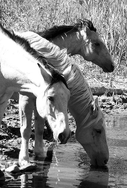
I like the poses of all three horses (individually), but they don’t seem to work together visually. To my eye, the image is quite busy. I feel that one or even two horses would have made a great subject, but three seems a bit like visual overkill.
The composition of this photo feels a touch claustrophobic to me, as if the right side of the shot was cropped a bit too tightly. I feel that more room on the right would help open this shot up and give it a touch more visual stability.
Black and white was an ok choice for this, but I wonder what the color image looked like. Like someone mentioned previously, the horse in the foreground seems a bit overexposed and its color is probably fairly washed out. Did you try shooting this with a faster shutter speed or smaller aperture?
I hope this helps,
Quadrajet
|





 Add photograph to your favorites
 Add photographer to your favorites


 Photographer found comment helpful.


