| Image |
Comment |
| 10/25/2008 06:52:22 AM |
Intensityby SaraRComment: Very nice, I have yet to try one of these and look forward to the day that I can. I really like your work.
To me the one thing this image needs is for the bird to be looking more toward the lens. |
 Photographer found comment helpful. Photographer found comment helpful. |
| 10/25/2008 06:50:33 AM |
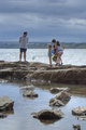
The Outingby SaraRComment: Very nice affect, I like the feel and your perspective for the image, the clouds add.
Two thoughts....the image seems "unbalanced" with the rocks running dead center in the image. I would consider cropping part of the bottom of the image. The other is that it is obvious that the ladies are not standing still so you lose the affect of a coversation on the rocks. Instead there is a "lack of permanence" to the image. |
| Photographer found comment helpful. |
| 10/25/2008 06:46:27 AM |
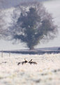
IMG_7665_conv.jpgby SaraRComment: Very nice, this has a smoothing message kind of affect.
Are those tame rabbits or did you happen on this?? If they are tame, it would have been nice if they were closer to the camera and a larger part of the image. I would have done a bit of cloning to remove the fence posts and the dark spots slightly below them. |
| Photographer found comment helpful. |
| 10/25/2008 06:42:37 AM |
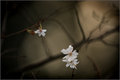
Blossomby SaraRComment: I really like the feel and overall affect of this image.
My gut tells me that the image is slightly out of balance...the bloom should be up further into the image. I also feel that the bloom is too small in the image....maybe cropping, but not so much as to lose the overall effect. |
| Photographer found comment helpful. |
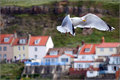
| 10/25/2008 06:40:24 AM |
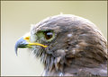
Gull over Whitbyby SaraRComment: Nice capture. Your exposure, focus, etc, are on the mark.
I will comment on a perfect world if you will allow. I find the buildings behind the bird distracting...hard to change when you take the image ( but compared to a perfect world)and it would have been nice if the wings were extended rather than brought in on the left (again, against a perfect world) |
| Photographer found comment helpful. |
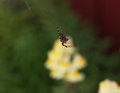
| 10/25/2008 06:37:15 AM |
the arachnoid flamingo danceby ShutterPugComment: I commented on the prior spider image and a lot of the same things are happening with this image. It would be nice if the spider was larger in the image (crop), depth of field will be a problem, and the really intense background draws you from the spider. |
| Photographer found comment helpful. |
| 10/25/2008 06:35:17 AM |
itsy bitsy spiderby ShutterPugComment: I have the same lens that you used on this image and it is really tough to get enough depth on field on something like a spider to make the image sing. I don't know that I have ever taken one that "sings". In this case, I think a much tighter crop would have brought the spider out more.
I think the background, especially since the spider is cut in half by the flower (I assume), distracts. It would have been better if the spider did not blend with the background so much. |
| Photographer found comment helpful. |
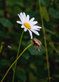
| 10/25/2008 06:32:07 AM |
Daisies in the rainby ShutterPugComment: I like this image.
I had to read the title before I realized what the odd striping was. A very odd and interesting affect. I would never have taken my camera into the rain. I too am distracted by the stem to the right. To my eye, cropping about the lower 1/3 of the image would have created a more balanced image.
I am not sure what to think of the dead flower. I often take photos of dead flowers because they have a lot of interest, but in this case it is not in the focal plane, so it almost distracts...not sure. |
| Photographer found comment helpful. |
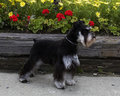
| 10/25/2008 06:27:35 AM |
9 months old and looking good!by ShutterPugComment: My instincts tell me that the back ground distracts rather than adds to the image. The pavement and tie wall, with the grass growing in the edge, detract from the image and provide horizontal lines that break up the dog. having a more uniform and more pleasing background would have improved the score. On my laptop the image appears a little flat as well. |
| Photographer found comment helpful. |
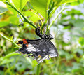
| 10/24/2008 07:38:59 PM |
Beautiful Deathby Purple_GirlComment: I gave your image a 5. The image struck me as being very busy, the background is a little too bright relative to the butterfly and though it probably has very sharp focus on the eye, the large f stop gave you a shallow depth of field that caused you to loose focus on the wings and the body. And, the wings appear a bit washed out....I would too if I were dead |
| Photographer found comment helpful. |
Home -
Challenges -
Community -
League -
Photos -
Cameras -
Lenses -
Learn -
Help -
Terms of Use -
Privacy -
Top ^
DPChallenge, and website content and design, Copyright © 2001-2026 Challenging Technologies, LLC.
All digital photo copyrights belong to the photographers and may not be used without permission.
Current Server Time: 07/21/2026 06:06:00 PM EDT.