| Image |
Comment |
| 04/05/2008 12:12:43 AM |
|
 Photographer found comment helpful. Photographer found comment helpful. |
| 04/05/2008 12:11:45 AM |
|
| Photographer found comment helpful. |
| 04/05/2008 12:09:07 AM |
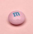
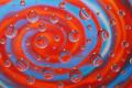
M is for Minimalism (4/4)by karmatComment: I like it, but would like to have seen sharper focus on the M&M. Great idea though; the pink on pink adds to the minimalist effect. |
| Photographer found comment helpful. |
| 04/04/2008 10:19:35 AM |
Precariousby bvyComment: Originally posted by sherpet:
Hey I really like the suggestion that Lisa makes about doing a desat on this image..... |
Yeah, okay, that might be fun. It would be a first for me. If I have time this weekend, I'll give it a try. |
| 04/04/2008 07:29:38 AM |
|
| Photographer found comment helpful. |
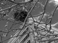
| 04/03/2008 09:36:27 PM |
Nestby bvyComment: Originally posted by thelobster:
Interesting POV - I think i'd like to see a little more contrast - how did you do the conversion ? |
Channel mixer layer; I sunk blue and raised red. I was deliberately going for a mid-key sort of shot. I thought it brought out the textures in the nest better. It seemed to keep the focal point there also. Admittedly I didn't spend hours on this. There are a lot of ways I could have processed it, I suppose. |
| 04/03/2008 09:32:41 PM |
Marble Toss by JMartComment: Yes this is cliche, and yes it's been done to death, but most likely for a good reason -- people love this kind of stuff! (The proof is in the ribbon.) Dr. Confuser's opinion is valid, but it doesn't say much about your particular shot. I don't mind a cliche so long as a.) the artist brings something original to it, and b.) it's well executed. You've succeeded on both counts. Nice work! Keep doing what you're doing, and congrats on your first ribbon. |
| Photographer found comment helpful. |
| 04/03/2008 09:24:50 PM |
Vby h2Comment: This is terrific. The colors and symmetery are appealing, and the POV is pure genius. Very abstract -- my kind of shot. |
| Photographer found comment helpful. |
| 04/03/2008 09:18:00 PM |
Diamonds Are Forever by bvyComment: Originally posted by eyewave:
Lunchtime in the city again, huh? very good shot, I like the slight red cast |
Wow, Oliver, you were on to me as soon as the starting gates flew open on this one. This means that either I'm developing a highly original style (which would be good) or that I'm becoming hopelessly predictable (not so good). I have to admit I'm running out of buildings to shoot; that hour for lunch (give or take) implies a certain radius. Anyway, thanks for your comments and support! |
| 04/03/2008 07:22:40 AM |
Nestby bvyComment: Originally posted by annig:
I bet the color on this was great...the buds, the blue sky! |
The color didn't really work because all the color was in the background (the building and sky). Also, since I shot in aperture priority (not sure if that was the best choice), the building is more or less in focus. I wanted to keep the nest as the focal point, but it was in the shadows. I used a channel mixer layer to level the playing field, so to speak, and work on some of the textures. Thanks for your comment! |
Home -
Challenges -
Community -
League -
Photos -
Cameras -
Lenses -
Learn -
Help -
Terms of Use -
Privacy -
Top ^
DPChallenge, and website content and design, Copyright © 2001-2026 Challenging Technologies, LLC.
All digital photo copyrights belong to the photographers and may not be used without permission.
Current Server Time: 07/22/2026 08:23:47 PM EDT.