| Image |
Comment |
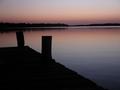
| 12/10/2003 05:15:29 PM |
Simplicity at the Docksby euskadiComment: I like the simplicity of the light and colors and composition. I like it this dark - it simplifies the forms. I wish there was more light space between the left hand post and the reflection of the trees in the water. |
 Photographer found comment helpful. Photographer found comment helpful. |
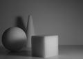
| 12/10/2003 05:12:20 PM |
Primariesby FactoryXComment: A very nice idea for simplicity (would have been GREAT for shapes too) I like the texture and sparkle of the styrofoam as it contracts to the background. Your lighting could be much better. Illuminating each figure equally and from more than one side - a white board to bounce the light back from the left would do well. |
| Photographer found comment helpful. |
| 12/10/2003 01:33:44 PM |
Lightby edmundtansoComment: Intriguing. I really like your idea - the light from the simple hole illuminating a small patch of the geometry of this dome. I think placing the circle of skymore to the left and a bit higher up would create a more dynamic composition. With less black space above it and around it the hole would seems like more of the source of light that it is - and the eye cold sweep down from there to the rest of the picture. With a bit brighter exposure revealing a bit more of the inside of the dome, it would be a bit more engaging. But still keep it relatively dark. |
| 12/10/2003 01:28:55 PM |
Remember the simple childhood days...by DCThiessenComment: Primary colors - simple. basic. Nice composition, simple but effective - bright yellow on the thirds line, and curving lines radiating to the edges of the picture. Bright and eye catching, but missing that elusive "wow factor" that I find so hard to get into my pictures (haven't found it yet.)8 |
| Photographer found comment helpful. |
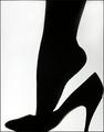
| 12/08/2003 06:46:04 PM |
The Night is Shaping Upby LindaLeeComment: This is one of two or three stand outs in this challenge. Simple, the silouette is perfect way to show shape - isolate shape from the other aspects of the photo. I like how there is a bit of dimension shown in the shoe as the light creeps arounf the edges. Lovely. Ther is a bit of a blury line next to the leg on the left I'd remove, and I might add a bit more white on the right or crop a little on the left for a perfect balance. Just being picky tho' - 9 |
| Photographer found comment helpful. |
| 12/08/2003 06:41:45 PM |
Starbucksby PaulMdxComment: Nicely lit, good focus, simple background. Nothing wrong per se, but nothing outstanding either. Perhaps more context or meaning would help me more. What are we supposed to think about this shape? Where is this? I wish I could be more helpful. |
| Photographer found comment helpful. |
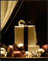
| 12/08/2003 06:35:41 PM |
Christmas Presentby crabappl3Comment: Interesting subject - it seems like a window display, but is it? It is truely crips on the ribbon where it comes over the side of the big box, but everything else is out of focus. It is that blurriness that looses the sense of the shapes in the picture. I like your set up, balls and boxes, but I wish that the depth of focus were greater. |
| Photographer found comment helpful. |
| 12/08/2003 06:32:58 PM |
Joshuaby deemerComment: There is a lot going on here - the shape of his face is covered with a false shape - the nose, glasses and eyebrows, then the magnifying lense further playes with the viewers perspective on the shapes in the imagel. It is eye catching, and amusing, but a bit busy. Wish there were a bit more light from the left side of the picture. |
| Photographer found comment helpful. |
| 12/08/2003 06:30:36 PM |
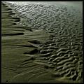
Seaside Arabesque by jjbeguinComment: This time I've looked through all the photos before I started to vote. Your's stood out on first viewing and it stand out now when I've looked at them all. You've caught the natural shapes of sand so crisply, chosen a great composition which both lets the eye travel into the distance and lets the viewer see what is happening by showing a before and after of sorts. It fulfils the challenge and it is the kind of picture yo;d love to see everyday hanging on your wall. 10 |
| Photographer found comment helpful. |
| 12/06/2003 09:31:12 PM |
Bécassineby kosmikkreeperComment: Beautiful. Lovely angle, the light catches those wiskers and makes them stand out against the black fur. I like the whote background, wish it weren't wrinkled, but I do like the idea of something white with a pattern, or white objects behind... but no cat would go for such a set up. 9 |
| Photographer found comment helpful. |
Home -
Challenges -
Community -
League -
Photos -
Cameras -
Lenses -
Learn -
Help -
Terms of Use -
Privacy -
Top ^
DPChallenge, and website content and design, Copyright © 2001-2026 Challenging Technologies, LLC.
All digital photo copyrights belong to the photographers and may not be used without permission.
Current Server Time: 07/23/2026 09:29:21 AM EDT.