| Image |
Comment |
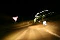
| 01/22/2004 11:11:10 AM |
KEEP LEFTby mrblobbyComment: Us Amricans have a hard time with rotaries - noone seems to understand this basic YIELD to cars in the rotary thing! You've got a disturbing angle here and all those squiggly lights - it does reflect how I feel when I'm in a rotary. Wish the rotary sign were sharper, not quite so bright. If there were something else - a car, a person, perhaps there would be more to ancor the eye. |
 Photographer found comment helpful. Photographer found comment helpful. |
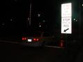
| 01/22/2004 11:07:31 AM |
Stop here on Red ! ! !by Sly_tonyComment: I like how you have captured the red lights just where tha arrow points at them. The light on the signs is a bit too bright, especially in contrast with the darkness of the photo. Cropping out some of the blackness on the right, bottom and left would focus the composition better. |
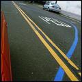
| 01/22/2004 11:05:11 AM |
The Thin Blue Lineby GeneralEComment: I like the composition - the yellow lines such a strong diagonal, and the blue waing back and froth. The car and the top and bit of a car at the left frame it nicely. Wish I could understand what the blue line is for by looking at the picture. The image lacks meaning. |
| Photographer found comment helpful. |
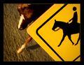
| 01/22/2004 11:03:23 AM |
Caution: Horse Crossingby AmiYuyComment: I like this idea and the angle. From the thumbnail I thought maybe this was a real horse (that would be hard to do!) I like the shallow dof makes it seem a bit more real. It is a bit disappointing tho - that it isn't real. |
| Photographer found comment helpful. |
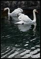
| 01/21/2004 02:41:43 PM |
Along the peerby jjbeguinComment: The swans are graceful and nicely captured, but my favorite part of the photo is the patterns in the water in the foreground! The way you have composed the picture tells me you like them too. |
| Photographer found comment helpful. |
| 01/21/2004 02:40:11 PM |
The effect of cold on spider websby pcodyComment: What a cool subject. Gives us a window into a world we don;'t usually see - that theme is very NG. Composition is good, web seems to hang from the edges of the picture. The blues ansd oranges work well together. |
| Photographer found comment helpful. |
| 01/21/2004 02:37:49 PM |
Bush Living 'tradition without technology'by camelotnorthComment: A nice "slice of life" picture. You can see so much of this woman's life in the details around her. Nice even lighting. I'd crop in more on the left, and I'd like to see a bit more of the foreground and the xmas tree (rt) - would pull the viewer into the picture from the front, focus the composition a bit more. 8 |
| Photographer found comment helpful. |
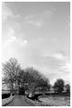
| 01/21/2004 02:34:14 PM |
Diversionby RemieComment: What a lovely black and white. I love the imbalance in the composition - the curve in the road and the trees fill the bottom with interest, contrast, detail. The airy sky floats above taking up most of the picture. Perhaps the diversion isn't the turn in the road, but into another dimension: up! Has the feeling of a 17th cent Dutch landscape painting. I'm not sure I'v ever seen anything like this in NG, but I'd like to see it on my wall. |
| 01/21/2004 02:30:47 PM |
Forgotten Peopleby browntComment: Wonderful, meaningful effect having the people walking by - you feel the motion perfectly. The fence frames the other side of your subject and works visually and thematically - he is fenced in my people's blindness. Having your suject so dark, and placed one third of the way in fro the right balances the composition, gives space for the movement of passers-by which is the other subject of the picture. Well done. I'd like to see what it would look like with the distance darkened up a bit - the brightness is a bit distracting. 9 |
| Photographer found comment helpful. |
| 01/21/2004 02:26:38 PM |
|
| Photographer found comment helpful. |
Home -
Challenges -
Community -
League -
Photos -
Cameras -
Lenses -
Learn -
Help -
Terms of Use -
Privacy -
Top ^
DPChallenge, and website content and design, Copyright © 2001-2026 Challenging Technologies, LLC.
All digital photo copyrights belong to the photographers and may not be used without permission.
Current Server Time: 07/23/2026 01:41:57 AM EDT.