| Image |
Comment |
| 07/20/2004 10:52:27 PM |
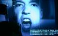
Two Minute Hateby bledfordComment: 1984. Interesting depiction. Words and power and overwhelm - wish we could see more of the person reacting to them. I like the cold blue color as well. |
 Photographer found comment helpful. Photographer found comment helpful. |
| 07/20/2004 10:50:50 PM |
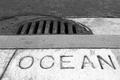
No Dumping.by faidoiComment: Ironic. I love the abstract shapes here and how they fill the space, how they contract in tone and texture. And in the midst of it all a bold word that simultaneously fits with the others, but doesn't. Very nice. 9 |
| Photographer found comment helpful. |
| 07/20/2004 10:49:21 PM |
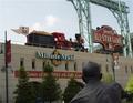
2004 All Star Gameby CamComment: An awful lot of words in this photo. That does say a lot about your subject - baseball is commercial. But the objects clutter the fram and with this arrangement I don't know what to look at first. Perhaps emphasizing something with a narrow depth of focus or with selective lighting would help the viewer understand better. |
| Photographer found comment helpful. |
| 07/20/2004 10:46:15 PM |
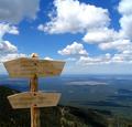
High Altitude Intersectionby LoudDogComment: What a glorious view! Perfect clouds. The light of the signs and the detail of the wood grain is good as well as focus, and still the landscape in the background is well lit and clear too. Nice job. I would like to see where the sign attached to the ground - as is it feels like it is oddly floating. |
| Photographer found comment helpful. |
| 07/20/2004 10:43:28 PM |
Sheeps have right of wayby drjeggleComment: Do they have nasty fangs? This picture made me laugh. I like the composition - the placemnt of the sign and the way the road bends away from it and heads into the desolate looking snowy mountains. It looks like it couldd have better resolution - a bit grainy and fuzzy. |
| 07/20/2004 10:41:11 PM |
Nasty Reflexionby BassieComment: Hee hee!! I had to look at this a few times to see how this worked. A clever idea. I cannot say the composition or the lighting is inspiring, but the photo serves its purpose in making us pay attention not only to the meaning of words but the form of the letters and possible reorganizations. |
| Photographer found comment helpful. |
| 07/20/2004 10:38:26 PM |
bibliyaby potogComment: I like the golden color and the rays of light across the page. But the words are out of focus, and we cannot see the texture of the page or get any context of where this bible is or what we should think about it. Perhaps a hand pointing out a special passage, or an object that relates to the text? |
| Photographer found comment helpful. |
| 07/20/2004 10:35:47 PM |
Tributeby Sparky9001Comment: While all these headlines are an interesting start, they alone are just too "flat" and without context. Where are they? Who is reading them? They could be in a trash pile or they could be carefull stacked by a desk waiting to go into a scrap book. The photo doesn't show us. |
| Photographer found comment helpful. |
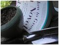
| 07/20/2004 10:33:31 PM |
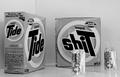
Misapplicationby nikon_girlComment: This is a funny idea! I like how you've played with the words and their meaning in reality. The written and the visual complement eachother and give the viewer a laugh. I like how you've filled the frame. The focus on the pot and spade if a bit soft, and the resolution seems grainy. |
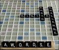
| 07/20/2004 10:30:04 PM |
Word Gamesby digitaldaveComment: Scrabble is a clever subject for the challenge. I would find this more interesting if you included the faces of players and how they react to the game/eachother. This feels too static. |
| Photographer found comment helpful. |
Home -
Challenges -
Community -
League -
Photos -
Cameras -
Lenses -
Learn -
Help -
Terms of Use -
Privacy -
Top ^
DPChallenge, and website content and design, Copyright © 2001-2026 Challenging Technologies, LLC.
All digital photo copyrights belong to the photographers and may not be used without permission.
Current Server Time: 07/18/2026 11:45:27 PM EDT.