| Image |
Comment |
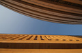
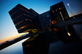
| 05/30/2006 09:27:39 PM |
Light & Shadow...by photoleonComment: This is a very imaginative composition - brings out a simple contrast between the two buildings and creates a nice absract group of shapes. You could pop the color more, perhaps boost the contrast. |
 Photographer found comment helpful. Photographer found comment helpful. |
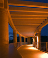
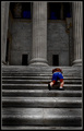
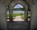
| 05/30/2006 09:25:36 PM |
Palace of the Governorsby dcanoComment: I like the contrast of orange and blue. The composition in good -leads the viewer in. However the railing on the left comes right at you in a way that makes me feel like I'm hit in the stomach. I'd take the picture more from the center of the path, and frame the sides with the blue sky. The lights on the pillars at the right are very blown out - too bright for the mellow mood of the photo. |
| Photographer found comment helpful. |
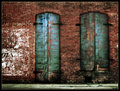
| 05/30/2006 09:20:31 PM |
Double Doorsby sherComment: Nice color, texture - work together to create real atmosphere. |
| Photographer found comment helpful. |
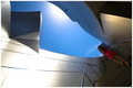
| 05/30/2006 09:19:37 PM |
Escapeby C-town driverComment: A wonderful concept. The blue sky creates a negative space/shape that point to the woman. I wish the light were better on her - she is somewhat lost in the shadows. The glare from the sun has blown out your highlights on the right. |
| Photographer found comment helpful. |
| 05/30/2006 09:17:22 PM |
Young Conquers Oldby gt7435bComment: This works very well - the placement of the child in the frame, the bright colors against the dark grays - all tell a story. Beautiful to look at too - great texture. |
| Photographer found comment helpful. |
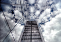
| 05/30/2006 09:12:20 PM |
Wuthering Heightsby AnastasiaComment: Fun play on the eye - which is sky and which is building? What is building and what is reflection? Nice contrast and color - hint of dark blue. |
| Photographer found comment helpful. |
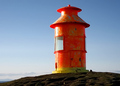
| 05/30/2006 09:09:57 PM |
Lighthouseby GujaComment: Fun color, simple composition - makes the viewer look close at the texture and shape of the structure and get the most out of it. Burning in that dash of clouds might add a little drama. The bright burnt out reflection is a bit distracting. |
| Photographer found comment helpful. |
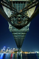
| 05/30/2006 09:07:40 PM |
Under the Bridge by admiralComment: Wow talk about moving the viewer eye into the frame! The bridge function to transport out eye across the frame to the city - nice composition. Great exposure and colors and reflections! Bumping up. 9 |
| Photographer found comment helpful. |
| 05/30/2006 08:39:10 PM |
After closing hoursby LalliSigComment: Daring, contrasty, dramatic and unusual composition (I really like the composition - with that bright light at the top corner anchoring the sweep on the building!). While it is hard to see architectral details, you do get a tremendous sense of shape and form and presence and I think that is the point here. Bumping up - 9 |
| Photographer found comment helpful. |
| 05/30/2006 08:36:19 PM |
Supportby karmatComment: The balanced composition suits your subject and enhances the serenity. Good work with exposure - must have been tricky. I understand by your title you were emphasizing the stength and solidity of the columns - but their bulk detracts a bit from the delicate view - craws the eye away from the view rather than towards - perhaps cropping a bit on the sides to lighted things up and make the voew proportionally bigger. |
| Photographer found comment helpful. |
Home -
Challenges -
Community -
League -
Photos -
Cameras -
Lenses -
Learn -
Help -
Terms of Use -
Privacy -
Top ^
DPChallenge, and website content and design, Copyright © 2001-2026 Challenging Technologies, LLC.
All digital photo copyrights belong to the photographers and may not be used without permission.
Current Server Time: 07/16/2026 11:46:13 PM EDT.