| Image |
Comment |
| 11/10/2003 09:30:13 PM |
Angel at the Entranceby Spork99Comment: The red and the stone are quite a combination! So grand, and yet i the end your eye comes to that simple calm angel. Wish the red paint weren't quite so shiny. 8 |
 Photographer found comment helpful. Photographer found comment helpful. |
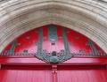
| 11/10/2003 09:29:01 PM |
Comeby mariomelComment: nicely framed with the words behind. Not very subtle, but effective. |
| Photographer found comment helpful. |
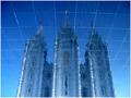
| 11/10/2003 09:27:28 PM |
Reflections on Eternityby dsidwellComment: cool reflection - the bottom of a tiled pool? the grid gives dimension to all that blue - like a diagram of the universe. very imaginative. 8 |
| Photographer found comment helpful. |
| 11/10/2003 09:26:26 PM |
steamy sanctuaryby darcyComment: Nice saturated colors, I like the soft focus - can see enough to get a sense of what is in the background without it being too distracting. The odd angle is almost as if one is reclining in the tub. very nice. 9 |
| Photographer found comment helpful. |
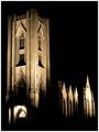
| 11/10/2003 09:24:35 PM |
God is in the Houseby NazgulComment: nice negative space. the darkness has a shape of its own. some of the lights (on the right, and above the door) are a bit bright. |
| Photographer found comment helpful. |
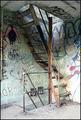
| 11/10/2003 09:23:30 PM |
sacred and profaneby SeanachaiComment: an interesting contrast. I like the diagonal of the stairs and how the railing points to the bottom left corner. the botto of the picture is a bit bright. 8 |
| Photographer found comment helpful. |
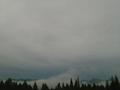
| 11/10/2003 09:21:56 PM |
Atop Sacred Groundby channeledComment: Mysterious fog and mountain peeks. But why all that blank sky? If you are atop a mountain I'd like to seee more of what you see below you. |
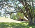
| 11/10/2003 09:20:41 PM |
Home Sweet Homeby christyrackComment: The dappled light is nice. The reaching limbs of the trees are graceful. The background is too bright. It would be ok to have the tree more silouetted and have the rest of the picture better exposed. |
| Photographer found comment helpful. |
| 11/10/2003 09:19:13 PM |
Hallowed Groundsby fisheyeComment: Nice and simple - I like the stark white of the stones, lined up and coming out of the corner - wish the grass were a deeper green, and wish the sky weren't so light (polarizing filter would work) |
| Photographer found comment helpful. |
| 11/10/2003 09:13:59 PM |
My Morning Spotby vtruanComment: what a beautiful spot. I like the dark line of shrubs between the real mountain and it reflection. Looks like you pushed the colors a bit much - there is a grainy artifact in the sky. I'd like to see it less magenta. |
| Photographer found comment helpful. |
Home -
Challenges -
Community -
League -
Photos -
Cameras -
Lenses -
Learn -
Help -
Terms of Use -
Privacy -
Top ^
DPChallenge, and website content and design, Copyright © 2001-2026 Challenging Technologies, LLC.
All digital photo copyrights belong to the photographers and may not be used without permission.
Current Server Time: 07/20/2026 03:53:12 AM EDT.