| Image |
Comment |
| 12/05/2003 07:56:25 PM |
Plasticby jodiecostonComment: Now that is an interesting angle. I like the gold color too, works well in a money challenge. With the bottom right corner didn't have those lines - papers? Just a shadow would be less distracting. Nice DOF use. 8 |
 Photographer found comment helpful. Photographer found comment helpful. |
| 12/05/2003 07:54:39 PM |
The Color of Money by TerryGeeComment: fun, lovely. I like the diagonal, the green cast, nice scattering of water droplets. Nicely done 9 |
| Photographer found comment helpful. |
| 12/05/2003 07:53:12 PM |
pennilessby peeceeComment: A good idea for the challenge. Perhaps one pocket would do as well as two? Or better for not splitting our attention. The balance of having both packets is ruined by the distracting and imbalanced background. The lighting is casting some harsh shadows that take away too. |
| Photographer found comment helpful. |
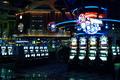
| 12/05/2003 07:51:10 PM |
The House Always Winsby unikornComment: I think a darker exposure might have brought out more of the marvelous light and color in the picture. You could loose most of the details in the dark spots without loosing your sense of the subject, and yo'd see more details in the light spots. Tighten up the composition a bit by cropping. |
| Photographer found comment helpful. |
| 12/05/2003 07:49:11 PM |
untitledby DieHappyComment: Ignoring the fact that there shouldn't be money...Ilike the idea of the money at the btoom of the jar, the blue glass is neat, but the lighting just isn't enought. I'l like to see bright blue, and some crips definition of the coins and bills. Light that comes thru the bottle would enhance the bottle's color, It would cast blue light on the money though. If there were a way to spotlight thhe money with a warmer light it would help it to pop out from th background. |
| Photographer found comment helpful. |
| 12/05/2003 07:46:33 PM |
...Is Powerby ScottKComment: nice evening light. Feels a bit cut short on the bottom. Perhaps a bit more context would add to the meaning? The subject, while imposing, feels static and useless. |
| Photographer found comment helpful. |
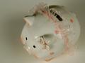
| 12/05/2003 07:44:02 PM |
Savings Accountby alanfreedComment: cute piggy bank. Would pop out more from a darker background. The glare from the light bulb is a bit distracting - a bit white board above the pig might even out the lighting and brighten it up a bit. Nice composition. |
| Photographer found comment helpful. |
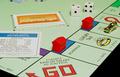
| 12/05/2003 07:41:27 PM |
You play, you pay.by keoneComment: I like the tightness of the composition. Just enough elements to get the message across. Wish the "GO" were lined up with the edge better, would feel better and have more impact. |
| Photographer found comment helpful. |
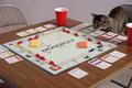
| 12/05/2003 07:36:15 PM |
Catopolyby Ram21Comment: cute. I sense yor careful set-up is about to be rearranged. You've done a good job of making the background unobtrusive, but natural. The composition doesn;t feel well reasoned out - perhaps cropping in so that the "monopoly" is coming down into the bottom left corner? Would bring attention to the important elements - what the game is, and the cat looking on. |
| Photographer found comment helpful. |
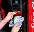
| 12/05/2003 07:32:52 PM |
Exact Change Only!by drgsoellComment: A frustrating situation, recognized by all. lots of money, but not ON you. A little soft on focus, composition is busy - maybe cropped in to the hands and the change slot ? |
| Photographer found comment helpful. |
Home -
Challenges -
Community -
League -
Photos -
Cameras -
Lenses -
Learn -
Help -
Terms of Use -
Privacy -
Top ^
DPChallenge, and website content and design, Copyright © 2001-2026 Challenging Technologies, LLC.
All digital photo copyrights belong to the photographers and may not be used without permission.
Current Server Time: 07/23/2026 09:07:08 PM EDT.