| Image |
Comment |
| 08/14/2007 09:00:43 AM |
|
 Photographer found comment helpful. Photographer found comment helpful. |
| 08/14/2007 08:55:49 AM |
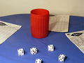
Yahtzeeby whiterookComment: If you don't mind a couple of random thoughts:
the set up and composition you chose somehow sends a message it's done fast without real thinking your picture through to the end.
E.g. the paper: if you really play, the paper in the middle should be upside down, right? A person would sit at the top part of the round table and write his/her score. BTW: with what? there are no pencils/pens to record the score.
While cutting/cropping the sheets of paper is a design tool and good, cutting right through the dice is not a good idea. It only shows that when you took the pic or in PP you were not looking out for details. More details: if you show a full house, the game seems to go on already. Show this to me with at least some entries on the paper.
Lightin is from one side only, but with 2 lamps? Try moving one of them the the right and a bit further away (fill light). This way you could avoid these irritating 2 shadows. You wanted to show people playing? Isn't the light then coming from the top? from a lamp right over the table?
I think you see where I'm going? The scene you are showing seems more like a random collection of more or less connected items. Arrange them as it would appear in real life and your picture will come to life all by itself.
There are a tremendous amount of dust specs(?) in your picture. Check your camera, or if it's not your camera, these dust specs should be removed before you shoot. |
| Photographer found comment helpful. |
| 08/14/2007 08:40:39 AM |
|
| Photographer found comment helpful. |
| 08/14/2007 08:38:04 AM |
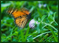
Animalsby bobgaitherComment: very colorful interesting figures. Try to get out there again and use a wider aperture to make the DOF much shallower. This way you can focus on one of the figures. The way you took the shot, the figures in the background are too much in focus and take the attention of the view from your center object.
And while you're at it, try differnt angles, from the bootm up, top down, from the front, the back. the rider's view, head on, get close, real close with the head are the main subject. |
| Photographer found comment helpful. |
| 08/14/2007 08:31:49 AM |
Roasted Porkby AFVComment: composition is good, DOF good, while focus is soft. you should focus on your lighting. try to use multiple lights to light up the entire scene and then additional light on _ I guess _ the knife or little piggy. If you brighten up your scene, there will be more your camera can work with, enhancing the focus. |
| 08/14/2007 08:28:03 AM |
|
| Photographer found comment helpful. |
| 08/14/2007 08:26:45 AM |
|
| Photographer found comment helpful. |
| 08/13/2007 09:56:15 PM |
Butterfly Wings 5by KatmystiryComment: I knew it, I KNEW IT.. they can fly!
The usual butterfly pic shows them frozen in time. When I see them in nature, THEY MOVE!! :) |
| Photographer found comment helpful. |
| 08/13/2007 09:54:46 PM |
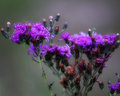
Violetby L1Comment: If you can retake the shot: try just bringing the left stem with flowers into focus while the right part could be blurred. Not that this is a suggestion, I'm just curious how this could look with the well blurred background and the right part OOF as well. Just an idea :)
I like the strong colors against the greyish background as well. Message edited by author 2007-08-13 23:28:23. |
| Photographer found comment helpful. |
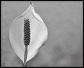
| 08/13/2007 09:51:26 PM |
Peaceby L1Comment: the blur enriches the simplicity of your picture. I'm sure it helps focus on what's important now. You're much better than we, keeping the plants alive. |
| Photographer found comment helpful. |
Home -
Challenges -
Community -
League -
Photos -
Cameras -
Lenses -
Learn -
Help -
Terms of Use -
Privacy -
Top ^
DPChallenge, and website content and design, Copyright © 2001-2026 Challenging Technologies, LLC.
All digital photo copyrights belong to the photographers and may not be used without permission.
Current Server Time: 06/26/2026 11:20:34 PM EDT.