| Image |
Comment |
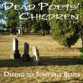
| 07/27/2004 01:20:14 AM |
Dead Poets' Childrenby Dr.ConfuserComment: Should be "Dying". The font is kind of cheesy looking for authenticity. The photo works okay as album art but I don't find it to be a great photo. |
 Photographer found comment helpful. Photographer found comment helpful. |
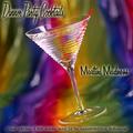
| 07/27/2004 01:18:26 AM |
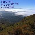
Dinner Party Cocktailsby EddyGComment: Cool cover. Don't like the band name--it sounds more like an album title. But the cover is really well done and accurate to the style. Good job! |
| Photographer found comment helpful. |
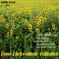
| 07/27/2004 01:17:34 AM |
Dense Photosynthetic Colligationby RefocusedComment: This was so well done! Right down to the choice of font. I love the wide angle for the field of sunflowers. I'm not nuts about the band name (partly because I don't know what colligation is) but it is a masterful 'reproduction' of a vintage album cover. Excellent. |
| Photographer found comment helpful. |
| 07/26/2004 01:25:38 PM |
Dead Peoples Clubby MAKComment: A bit overwhelming. There's a lot going on here with the huge font at the top and the vertically aligned text at the side. The person peeking out from behind the headstone is almost unnoticible at first. The guitar has a squashed, distorted appearance. I think a smaller font and different placement would make this less cluttered looking. |
| Photographer found comment helpful. |
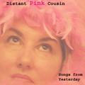
| 07/26/2004 01:22:17 PM |
Distant Pink Cousinby GraciousComment: The pose and feathered headdress work really well as 'vintage' album art. The model looks a bit too tired to be really authentic for this idea. The soft focus helps but I can still see the bags under her eyes and the lines in her lips. More dramtic eye make-up would brighten things up. Overall, well done. |
| Photographer found comment helpful. |
| 07/26/2004 01:18:52 PM |
deep pierced cutby theodor38Comment: I really don't like the band name. It sounds very awkward. Maybe Deeply Pierced Cut would have worked a little better? The text looks over Photoshopped to be authentic. The photo works well, although the glowing edge of the blade against the skin looks strange. |
| 07/26/2004 01:15:48 PM |
|
| Photographer found comment helpful. |
| 07/26/2004 01:15:05 PM |
In the shops now!by kevrobertsonComment: The band name is interesting. I don't really see how this photo fits. It certainly doesn't fit if these kids are the band. It seems to esoteric and fey to be a name created by two boys in casual sports attire. The text has an amateurish quality to it. Meaning, too much filtering, IMO. One wouldn't really see this done on actual cover art. This really just doesn't work for me. |
| Photographer found comment helpful. |
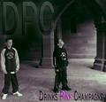
| 07/26/2004 01:12:00 PM |
Diseased Purple Cowsby DefyTimeComment: I'm not crazy about the band name. The cows look pretty healthy. They don't seem to mind that they've been Photoshopped. ;-D I'm not nuts about the weird orange sky. It kind of shouts out that the cows have been altered according to DPC rules (in other words--the whole image). Text would help convince me. |
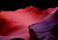
| 07/26/2004 01:09:27 PM |
Deep Purple Canyonby jefalkComment: Another Deep Purple name. Kind of boring. The photo is well-done and interesting. Text would help convince me this was 'authentic' cover art. |
| Photographer found comment helpful. |
Home -
Challenges -
Community -
League -
Photos -
Cameras -
Lenses -
Learn -
Help -
Terms of Use -
Privacy -
Top ^
DPChallenge, and website content and design, Copyright © 2001-2026 Challenging Technologies, LLC.
All digital photo copyrights belong to the photographers and may not be used without permission.
Current Server Time: 07/23/2026 10:54:32 AM EDT.