| Author | Thread |
|
|
08/05/2004 05:26:52 AM |
Hello Marac from the Critique Club
This is a wierd sort of image. I like it very much yet it is quite spooky with that head sort of just hanging there (I am not going to look at it any more I have to go to bed soon! LOL!)
The guitar does look super imposed how did you do that it almost looks one dimentional
The detail, focus, lighting are great colour very good
There were a lot of good images in this challenge and I think the voters seemed to be put off by fonts as I look through the comments of yours and others. I think your image did well but it is very frustrating when others seem to do much better
Your idea may have put a few people off. Spooky! The name is good for a rock C D
I hope that you have sucess in future challenges and I wish you Good Luck
If you have any questions please feel free to P M me
Regards
Sally |
|
 Photographer found comment helpful. Photographer found comment helpful. |
Comments Made During the Challenge  |
|
|
07/27/2004 05:07:41 AM |
|
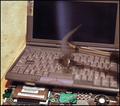
Eep! Ringu! I really like the colors, but something about the lighting makes the guitar look superimposed. |
|
| Photographer found comment helpful. |
|
|
07/26/2004 05:48:01 PM |
Very funny. Very creative!
Love the album name. |
|
| Photographer found comment helpful. |
|
|
07/26/2004 01:25:38 PM |
|
A bit overwhelming. There's a lot going on here with the huge font at the top and the vertically aligned text at the side. The person peeking out from behind the headstone is almost unnoticible at first. The guitar has a squashed, distorted appearance. I think a smaller font and different placement would make this less cluttered looking. |
|
| Photographer found comment helpful. |
|
|
07/26/2004 06:53:02 AM |
|
I didn't see the head behind the grave to start off with, thats quite creepy! Its a nice shot, but I think doing it at night, with some heavier post-processing for dodge/burn, would really bring out the atmosphere even more. |
|
| Photographer found comment helpful. |
|
|
07/26/2004 12:17:09 AM |
the head is just out of place...would be better without it
|
|
| Photographer found comment helpful. |
Home -
Challenges -
Community -
League -
Photos -
Cameras -
Lenses -
Learn -
Help -
Terms of Use -
Privacy -
Top ^
DPChallenge, and website content and design, Copyright © 2001-2026 Challenging Technologies, LLC.
All digital photo copyrights belong to the photographers and may not be used without permission.
Current Server Time: 06/30/2026 06:36:16 AM EDT.