| Image |
Comment |
| 08/24/2004 05:50:42 AM |
Its all Natural!by tolovemoonComment: Seems like a snapshot with little though regarding light, position, or pose. the kid whilst cute has redeye which is easily fixed in an editing program. You have used the flash which really doesn't flatter people when used head on, try using some window light next time -on babys it makes a big difference.
|
| 08/24/2004 05:49:06 AM |
In Reposeby ToddhComment: Very well taken effort. Maybe a touch too much grain I am not sure perhaps 2% too much. I also would have blacked out the background - the pattern is quite a distraction.
All in all though I like this - 2% extra grain or not.
10 for you.
|
 Photographer found comment helpful. Photographer found comment helpful. |
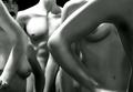
| 08/24/2004 05:47:23 AM |
Waiting in Lineby ccaseyComment: Nice abstract feel to this, almost reportage style.
Try cropping the top 1/4 on my screen if I cut it off so it's just torsos it look more dramatic. |
| 08/24/2004 05:46:28 AM |
La Femmeby ScantyNebulaComment: I have to start by saying I hate the border and hate the way she is appearing out of it. But more lots will like it. Even if you are going to use this old technique, i would have kept on part of her under the border - either the head or the breasts that at least gives it some 'pop-out' which is what most people use it for..
Anyway i am here to comment on your photography not your design skills - good job :D
I love it, quite light and feathery - nice high key effect gives her skin a smoothness that is to kill for. Her hair is perfectly posed over her breasts which is kind of viking-esq in a way.
her skin seems flawless which is another good factor. Her lips are great and well posed - half open kind of pouting.
I would think the image would be nicer minus the specs, they kind of fight against the whole softness of the photo. I also would tidy up teh flyaway hair strands - although I would guess that they are there by design.
A very pretty girl too. Overalla super shot that will easily be top 10! |
| Photographer found comment helpful. |
| 08/24/2004 05:39:59 AM |
Patternsby CamazineComment: A common shot well taken. Congrats for filling the whole frame, no one on here ever seems to do that, I think in your case it works extremely well. I also like your choice of focusing on the belly button rather than the breast, although keeping them in again was a wise choice.
Nice shot that I am sure will hit the top 10.
|
| Photographer found comment helpful. |
| 08/24/2004 05:38:13 AM |
The Versatile Womanby RefocusedComment: So much potential here. For starters, the lighting is top notch - not sure if its natural or artificial but i like it. The floor ruins it in my opinion. They don't need grounding and feel they would have been better cropped off the bottom. Also I would like to see the face moved around to be facing her own legs, a bit of comedy thrown in.
|
| Photographer found comment helpful. |
| 08/24/2004 05:36:34 AM |
Water ,Wine And Featherby MonaComment: Hehe another comic shot - like your title and you seem to be having a good time.
Aesthetically it doesn't cut the mustard with me, kind of more like holiday snapshot than a nude photographic piece of art.
Black and white I feel was a wrong choice here, with red wine, tattoos and a white soft feather there is more potential in color.
|
| Photographer found comment helpful. |
| 08/24/2004 05:34:46 AM |
Closed Inby FotowereldComment: Kind of like a big fetus ;)
I like the lighting on this - it seem very natural and like window light. the pose is good, although i would have shot it the other way and placed more emphasis on the head rather than the arse.
A competent entry. |
| Photographer found comment helpful. |
| 08/24/2004 05:33:07 AM |
Multiple Personalitiesby wickedpeteComment: Very good, a full color nude. Tattoos make this interesting, but I can't help but feel more could be done with your ability of a double exposure in camera. Perhaps more of a symmetrical figure, or them intertwining like and hourglass.
|
| 08/24/2004 05:31:33 AM |
Mind, Body and Spirit by nico_blueComment: A very nice pose - unique and full of tension. But the sheets really bother me. The shadow kind of gets in the way too. I would remove in PS and perhaps replace witha reflective surface?
|
| Photographer found comment helpful. |
Home -
Challenges -
Community -
League -
Photos -
Cameras -
Lenses -
Learn -
Help -
Terms of Use -
Privacy -
Top ^
DPChallenge, and website content and design, Copyright © 2001-2026 Challenging Technologies, LLC.
All digital photo copyrights belong to the photographers and may not be used without permission.
Current Server Time: 07/17/2026 10:32:48 AM EDT.