| Image |
Comment |
| 01/02/2009 11:49:36 AM |
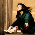
Day 02 - Jeeheby shalrathComment: Composition: Again with the leading lines. Beautiful. Great square crop too.
Lighting/Exposure: Great spotlighting of sunshine on her face. I like the contrasty feel.
Pose: I'd like to see this with her arms on her shins. The way you have her posed isn't bad, don't get me wrong, it is quite pensive. I would just like to see a variation to see if it works too :P
Suggestions for Improvements: Again, you have me at a loss :)
Her hair blowing in the wind really adds a little extra to this image. Very nicely done. |
 Photographer found comment helpful. Photographer found comment helpful. |
| 01/02/2009 11:43:44 AM |
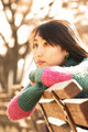
Day 01 - Jeeheby shalrathComment: Composition: You have a great angle on this one. I like that you bent down and didn't shoot from over her. Your leading lines are always SO wonderful.
Lighting/Exposure: I am lovin this light. Her hair is just aglow with beautiful warmness.
Pose: Her arms lead right back into her face. It's really quite striking. I appreciate that you followed all of the rules for excellent portraiture.
Suggestions for Improvements: I can't think of any at all.
Glad to be doing this SC with you. She is a very beautiful subject. I loved your card :) |
| Photographer found comment helpful. |
| 01/02/2009 11:39:25 AM |
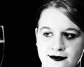
Again I Go Unnoticedby incubusComment: Composition: Your placement in the frame is great!
Lighting/Exposure: I like the way the light falls off gradually in this one. Much less harsh and much more appealing low-key. Very nice sharpness and light in the eyes.
Pose: The hand on the chin is really good here. It lets me see that you are actually thinking about something and are not just a floating head :) I really like the tilt of the head too.
Suggestions for Improvements: Nada.
I prefer this type of processing. It looks much more natural and is much more appealing to my eye. Very nicely lit considering you only used a computer :) |
| Photographer found comment helpful. |
| 01/02/2009 11:34:41 AM |
ariel_day1.jpgby stupidcatComment: Composition: Portrait rule: Never ever ever crop the chin. Crop the forehead all you want, but not the chin. :) I agree with Dylan about the glass.
Lighting/Exposure: If you are using some other light source, I don't really see the need for the flash. I think this would have been oodles better had you just used your shop lights. I am not fond of what it did to her eye on the right.
Pose: Not really applicable as it is just a face shot :)
Suggestions for Improvements: Comp: pan out a bit and move the glass into the shot. I really think with the silhouette, it would have given it a little something extra. I would have liked to see her head turned a bit more to the left here. PP: I am still trying to work out why you chose to just make one eye green but the B&W conversion is nicely done. :)
I am a great fan of the Twilight books as well. Your daughter is very pretty! |
| Photographer found comment helpful. |
| 01/01/2009 07:54:38 PM |
gleeby photokariangelComment: Composition: I love love love LOVE your position in the frame and the way your arms lead me right back to your face no matter where I start from in the photograph.
Lighting/Exposure: Soft and pretty light you have going on here.
Pose: Watch those little fingers, you seem to have lost one ;)
Suggestions for Improvements: Ummmmmmmmmmmm..... I may have to get back to you on this one :P |
| Photographer found comment helpful. |
| 01/01/2009 07:28:54 PM |
Marshall and Syd.JPGby avalanche1030Comment: Composition: Your angle is good but not fantastic. You cut off the dogs feet and that back piece of wood is running right through his neck. LOL!
Lighting/Exposure: Your light is a bit flat, I am guessing sunlight at around 1 or 2 pm? Other than that, I see no severely blown out or shadowy areas, which is good.
Pose: I like the way the dog and the man are directly above one another. I would like to see their heads closer together though. It makes the pose tighter.
Suggestions for Improvements: Composition: Perhaps a step to the right and a bit of a stoop would have helped this a bit. Rarely should you shoot straight on with no tilt or turn of the head or subject and stooping would have eliminated the wood in back running through the head and might have helped with the dog's feet as well. Lighting: Earlier in the morning or later in the evening make for the best lighting. Try to get outside earlier or later (depending on your sleeping habits). Exposure: Try for a higher f-stop or move the man's face further forward into the focal plane. That way the dog and the man can both be totally in focus. Pose: When taking a portrait, remember that you are in control of the shoot. Don't be afraid to guide your subjects. You know more than they do :) |
| Photographer found comment helpful. |
| 01/01/2009 07:10:22 PM |
make yourselfby incubusComment: Composition: I love your placement in the frame. It is very interesting. Good use of rule of thirds.
Lighting/Exposure: Though the message you are trying to convey comes through, it is just a bit on the contrasty side for me and a wee bit dark overall.
Pose: If it weren't for the pose and setup here, I would be a bit lost as to what you were trying to convey. As it is, this is just a perfect example of a re-creation metaphor. Your expression is perfect. Very nicely posed!
Suggestions for Improvements: There are a couple of hot pixels here. One by your hand, three in the chin area, and one in the eye area. Dunno if you saw them :) A generally lighter image which really comes down to personal preference and lighting choices. Again, just a tad too dark for me.
I look forward to seeing more of your work. :) |
| Photographer found comment helpful. |
| 01/01/2009 07:03:00 PM |
Day 1: Haley and Abbeyby socalsteveComment: Okie dokie, here is the format I am going to use for comments this month :)
Composition: I really like the way you have them placed in the photo and the angle of the camera here. They look very close and it really brings in that sense of family.
Lighting/Exposure: Your exposure is good on their faces. I am guessing you used an onboard or hotshoe flash aimed right at the subjects. Camera attached flash really creates flat lighting if not used with some type of diffuser though. I see it in the really bright spot on the boy's hat. I do like that you managed to avoid shadowing on his eyes even with the hat on.
Pose: Again, the fact that they are touching here really brings this together, IMO. Both of their heads angled the same way makes for wonderful symmetry.
Suggestions for Improvements: For the lighting: Try using some type of opaque plastic and bending it around the flash. Perhaps secured with rubber bands. For PP: I would like to see softer catchlights in the eyes. This can be faked by using a soft round brush in PS and just painting over where the catchlights already are. For the pose: I would like to see more of her face. She is a cutie and should show it off. :)
All in all a very lovely, and very festive, shot. |
| Photographer found comment helpful. |
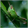
| 12/26/2008 11:23:14 AM |
summer rain by rozComment: And congratulations to yourself as well!! Another BLUE!! :D yayyyyyy!! Your insect photography is just amazing. Well done! |
| Photographer found comment helpful. |
| 12/24/2008 12:19:58 AM |
|
| Photographer found comment helpful. |
Home -
Challenges -
Community -
League -
Photos -
Cameras -
Lenses -
Learn -
Help -
Terms of Use -
Privacy -
Top ^
DPChallenge, and website content and design, Copyright © 2001-2026 Challenging Technologies, LLC.
All digital photo copyrights belong to the photographers and may not be used without permission.
Current Server Time: 07/16/2026 05:04:45 PM EDT.