| Image |
Comment |
| 01/09/2009 08:51:38 AM |
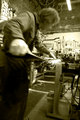
Tech IIby jhess77Comment: Composition: I prefer this angle. Very interesting. Makes me feel like I am about to go through that sharpener.
Lighting/Exposure: Perfect.
Pose: N/A Candid.
Suggestions for Improvements: None. I really like this a lot.
Sepia works very well for this photo, IMO. Very nicely done. |
 Photographer found comment helpful. Photographer found comment helpful. |
| 01/09/2009 08:44:06 AM |
Tech by jhess77Comment: Composition: I like all of the added stuff in the frame. Really nice environmental portrait.
Lighting/Exposure: Very nice. You were workin' with what you had. You did it well.
Pose: N/A candid.
Suggestions for Improvements: None.
This is very creative. I like the bit of blur on the person. Very nice use of slow shutter speed. |
| Photographer found comment helpful. |
| 01/09/2009 08:40:41 AM |
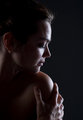
Irinaby LevTComment: Composition: I like the profile shot. Her positioning in the frame is really good. I like that she is looking into the photo.
Lighting/Exposure: Both are very nice.
Pose: Not too fond of the hand. It looks strange because of the wrist crop.
Suggestions for Improvements: If you get a chance to reshoot this, I will suggest the following: Have her bring her hand all the way up to her shoulder. Have her drop her shoulder and sit up very straight with her head high. It will provide a visual difference or gap between her head and torso and it will prevent cropping at any joints.
This is a lovely portrait overall. You did a fine job with that exposure. I always have trouble getting my focus just right in low light situations. Nicely done! :) |
| Photographer found comment helpful. |
| 01/08/2009 10:33:44 AM |
Twilighterby stupidcatComment: Composition: I like the way it feels like we have interrupted her reading.
Lighting/Exposure: DOF is great. Light is nice but a little flat.
Pose: N/A since it is a bit of a candid style shot.
Suggestions for Improvements: Perhaps move the light on the right side a bit higher. The way you have them now lights her very evenly and makes her very 2D. Generally, with a portrait or any other style of shot, you are looking to create a feeling of depth with your lighting. She needs some shadows somewhere :)
You nailed the focus in this shot. Her eyes really pop out of this photo. Very nice environmental portrait :) |
| Photographer found comment helpful. |
| 01/08/2009 10:28:10 AM |
#4by breadfan35Comment: Composition: I love the negative space. Beautiful!
Lighting/Exposure: Perfect. Those catchlights are really beautiful.
Pose: Loving the head tilt. Perfect.
Suggestions for Improvements: None.
This is such a lovely portrait. I really feel a great connection with the subject. Very nicely done. |
| Photographer found comment helpful. |
| 01/08/2009 10:25:50 AM |
your smile makes me smile.by photokariangelComment: Composition: I really like any type of photography that runs in a strip.
Lighting/Exposure: I really like the reflections of the windows in your eyes. It's very distinct.
Pose: N/A
Suggestions for Improvements: None.
The full view really blows socks off!! :) |
| Photographer found comment helpful. |
| 01/08/2009 10:19:59 AM |
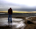
Baby Stepsby incubusComment: Composition: I really like your position in the frame.
Lighting/Exposure: Love the colours in the sky. Overall image seems a tad blurry. Could be the NN though.
Pose: I think it's perfect for your title.
Suggestions for Improvements: A crop of the white space at the top and perhaps a bit of USM. I see you didn't use it. I am not sure if it would have helped but would be worth a try.
This image connects wonderfully on an emotional level. The yellow and orange do well to convey caution. :) Nicely done. |
| Photographer found comment helpful. |
| 01/07/2009 10:58:45 AM |
The Old Song Man by SandyPComment: WOOHOO!! Congratulations Sandy!! :) You certainly have a knack for these types of portraits. Way to go! |
| Photographer found comment helpful. |
| 01/07/2009 10:53:12 AM |
Day 05 - Jeeheby shalrathComment: Composition: Wonderful. I love the leading line of candles to the subject.
Lighting/Exposure: I like the catchlights in her eyes from the candles and the soft light they have created on her face.
Pose: I appreciate the fact that her face is not actually ON her hands. It distorts the features, IMO. Very nicely posed.
Suggestions for Improvements: Nada.
Thanks for the mini tutorial. :) |
| Photographer found comment helpful. |
| 01/07/2009 10:49:11 AM |
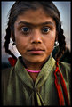
The Rural Girlby bnileshComment: Composition: Your crop is wonderful here.
Lighting/Exposure: The light makes her look old beyond her years. The darkness around her eyes and her mouth, the fact that her hair looks to be losing it's colour, all work together to capture that feeling.
Pose: I'd like to see her head turned a bit one way or the other.
Suggestions for Improvements: A little bit of soft light on her face might bring the girl back out.
This is a very striking portrait. Conveys a strong feeling of adulthood from a child. Rather haunting, actually. Can't wait to see more! :) |
| Photographer found comment helpful. |
Home -
Challenges -
Community -
League -
Photos -
Cameras -
Lenses -
Learn -
Help -
Terms of Use -
Privacy -
Top ^
DPChallenge, and website content and design, Copyright © 2001-2026 Challenging Technologies, LLC.
All digital photo copyrights belong to the photographers and may not be used without permission.
Current Server Time: 07/16/2026 11:18:39 PM EDT.