| Image |
Comment |
| 04/26/2006 09:16:38 PM |
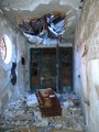
Backyard Treasureby glad2badadComment: I like the subtle use of the star filter here. There's not much impact as far as complementary colors go, though. |
 Photographer found comment helpful. Photographer found comment helpful. |
| 04/26/2006 09:13:31 PM |
|
| Photographer found comment helpful. |
| 04/26/2006 09:13:06 PM |
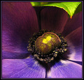
Harmonyby bledfordComment: It's difficult to tell, with this, if you are making a statement with your border or using it to cover up portions of your photo that are best removed. While I can appreciate borders that aren't "standard," this one isn't really doing it for me. The colors of the photo look beautiful, though. |
| Photographer found comment helpful. |
| 04/26/2006 08:21:29 PM |
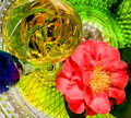
Camilia and Chardonnayby cislanderComment: This is just too busy. There are too many things to look at...the detail of the plate (I'm assuming that's what that is on the bottom), the multiple glasses, the patterns within the glass, the details of the flower, etc. The POV feels off-keel and the overall lighting feels a bit harsh. |
| Photographer found comment helpful. |
| 04/26/2006 08:18:53 PM |
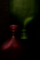
Emptyby TuckersmomComment: Oh goodness. I have to admit, I'm not especially a fan of these and they seem to be getting crazier every week! That being said, I think you could improve this shot by lining up the glasses better...having them be exact opposites. The background is just too busy for me. It'll probably score very well! :) |
| Photographer found comment helpful. |
| 04/26/2006 08:16:41 PM |
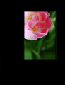
Fallen.by BrookeComment: To be honest, this seems more like "here is a shot I took this week" than a conscious entry into a complementary colors challenge. |
| 04/26/2006 08:15:07 PM |
SYMMETRYby imagesloyolaComment: I like this. I like the darkness and subtle colors. My only complain is that, despite the title, they don't seem to be symmetrical but offset to the left a bit. A little trim off the right would help, I think. |
| 04/26/2006 08:13:16 PM |
Bladesby caro_08Comment: The lighting seems awfully harsh on this. A later time in the day might have worked better. |
| 04/26/2006 08:11:08 PM |
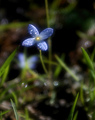
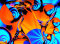
blue stainby magnexComment: Not sure what this is and not sure how it fits the challenge. |
| 04/26/2006 08:08:30 PM |
Arabiaby xXxscarletxXxComment: Nice colors but I don't especially like the processing in the face. It's a bit bright. |
| Photographer found comment helpful. |
Home -
Challenges -
Community -
League -
Photos -
Cameras -
Lenses -
Learn -
Help -
Terms of Use -
Privacy -
Top ^
DPChallenge, and website content and design, Copyright © 2001-2026 Challenging Technologies, LLC.
All digital photo copyrights belong to the photographers and may not be used without permission.
Current Server Time: 07/18/2026 02:05:09 PM EDT.