| Image |
Comment |
| 05/15/2003 11:45:37 AM |
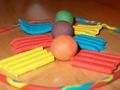
Plastecineby hawkidaComment: Front of the ring is way too blurry - the challenge is primaries and while I see them on the sides leading to the secondaries, it's the balls that I see as the center of the shot. Good effort. |
 Photographer found comment helpful. Photographer found comment helpful. |
| 05/15/2003 11:44:11 AM |
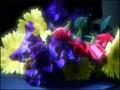
Nature's Primary Colorsby sherryk471Comment: I'm so torn over this shot. Half of me says "look at how well someone used soft focus, added a blur and composed a beautiful shot. The other half of me says the yellows are blown out, the ones underneath look crushed and this shot could have been done so much better. I'm torn! |
| Photographer found comment helpful. |
| 05/15/2003 11:42:06 AM |
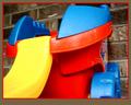
Transporterby pitsamanComment: This seems a little blurry and the yellow is a tad blown out on the corner. The background here distracts from the smooth lines and soft feel of this kids' toy. |
| Photographer found comment helpful. |
| 05/15/2003 11:41:04 AM |
|
| Photographer found comment helpful. |
| 05/15/2003 11:40:06 AM |
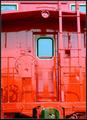
Primary Red Cabooseby cmrk74Comment: There are so many shades of red here that it's wonderful. I read into the challenge that we needed or should have 3 colors - so I'm obliged to mark it down for that, but compositionally and colorwise it's nice. I am not fond of the direct harsh lighting but it brings out the colors. |
| Photographer found comment helpful. |
| 05/15/2003 11:38:50 AM |
Primary Colors in the skyby bcncrazyComment: Interesting post processing. I don't see any yellow and the red you have is pink. Really it's just a blue sky with some saturation issues. |
| 05/15/2003 11:37:15 AM |
primary colorsby GotchyaComment: Who peed on the flag? Doesn't work because it's unnatural. There ARE red/yellow/blue flags... |
| Photographer found comment helpful. |
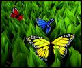
| 05/15/2003 11:35:21 AM |
Butterfly Fantasy by dsidwellComment: Great use of color - solitary colors here work extremely well among the repetitious greens. I would have actually put the blue or red closest, since their colors are more striking and exciting. Great work here either way. 8 |
| Photographer found comment helpful. |
| 05/15/2003 11:33:21 AM |
Primary Coatrackby myqylComment: Such a childlike atmosphere in this shot. The border really ADDS to this pic - and that's saying something. Excellent use of availables! |
| Photographer found comment helpful. |
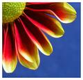
| 05/15/2003 11:32:42 AM |
Petals by agwrightComment: I wish the pistil/stamen were more yellowy instead of green, and I can't imagine that's much more than a hue adjustment - the red/yellow/blue you have here is absolutely wonderful. The composition says that you knew exactly what you were going for here - the blue negative space is excellent. Great all around. 9 |
| Photographer found comment helpful. |
Home -
Challenges -
Community -
League -
Photos -
Cameras -
Lenses -
Learn -
Help -
Terms of Use -
Privacy -
Top ^
DPChallenge, and website content and design, Copyright © 2001-2026 Challenging Technologies, LLC.
All digital photo copyrights belong to the photographers and may not be used without permission.
Current Server Time: 06/20/2026 08:39:27 AM EDT.