| Image |
Comment |
| 08/05/2004 01:03:44 PM |
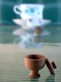
Miniture wooden bowl with lidby kirtiebuComment: The distortion on the "bowl" is a bit distracting. but I know that I am sure you couldn't have prevented this from the angle you are at. Everything seems realy centered. I personally would have liked to have seen the small item and the larger item in opposite corners of each other and maybe eleminate some of the space in the middle of the frame. Using either a different angle or moving the objects closer together. I like the idea though and I like the use of dof. |
 Photographer found comment helpful. Photographer found comment helpful. |
| 08/05/2004 12:58:49 PM |
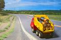
Coppertop Carrierby BikeRacerComment: Is this on a picture? I guess it would have to be to make the truck look that big. Too bad this wasn't an advance challenge. Then you would have been able to blend lines where you can see that it is not a real backgroun. Great idea though. Good composition. |
| Photographer found comment helpful. |
| 08/05/2004 12:56:08 PM |
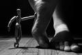
MiniMeby christoComment: Would have been a good one for the feet challenge as well. I like the dramatic light with the exception of the shadow casted on the foot that is flat on the floor. Some fill light would have evened it out a little bit. That is just my opinion though. Good composition as well. |
| Photographer found comment helpful. |
| 08/05/2004 12:47:18 PM |
Does size matter?by imolaavantComment: I feel that the image is a little boring to look at. There isn't enough detail. I really like the idea though and I find it very humorous. |
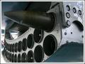
| 08/05/2004 12:45:29 PM |
rocketby bojanComment: I got to be honest with you. I have no idea what is supposed to be minature. However I love the shot. Really good colors and I like the composition. I could see this image in a book or something that is talking jets or whatever this is attached to. Nice image. |
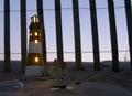
| 08/05/2004 12:41:46 PM |
Fenced inby LtHousLadyComment: I like this one. For my personal taste I would have liked to have seen some more light kicked in to light up the front of the light house some more. I also would have liked to have seen the lighthouse closer to the fence for two reasons. One, so that the size of the light house was more evident and second, so that the lighthouse tower would fit better between the fence posts allowing better seperation between the tower and the fence. |
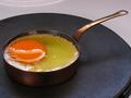
| 08/05/2004 12:37:59 PM |
Frying an egg (in a miniature pan)by GinaRothfelsComment: I like the idea, but the image seems to be lacking something. It slmost appears to be a little flat. Maybe a stronger tilt would help some as well. Very coll little frying pan. |
| 08/05/2004 12:36:11 PM |
Handsby Faye PekasComment: This is a great shot. One of my favs anyway. The colors are nice and I like the composition. |
| Photographer found comment helpful. |
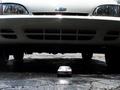
| 08/05/2004 12:34:49 PM |
smaller but bigger engineby mrwaffles989Comment: The blown out high lights are a bit distracting and almost make all of the details in the little car disappear. The image seems a bit tilted too. However I like the angle you went with and the choice to only show part of the large car. |
| Photographer found comment helpful. |
| 08/05/2004 12:32:23 PM |
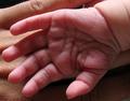
Would you accept her hand?by spaque99Comment: Just because it is the way I normally present hand shots, I would really like to see this image in black and white. The lines and details just really seem to jump out at you when in black and white. I like the composition and the light, but I would like to see the little hand more in focus and the large hand a little softer. Just my opinion though. Good work. |
| Photographer found comment helpful. |
Home -
Challenges -
Community -
League -
Photos -
Cameras -
Lenses -
Learn -
Help -
Terms of Use -
Privacy -
Top ^
DPChallenge, and website content and design, Copyright © 2001-2026 Challenging Technologies, LLC.
All digital photo copyrights belong to the photographers and may not be used without permission.
Current Server Time: 06/02/2026 07:16:41 AM EDT.