| Author | Thread |
Comments Made During the Challenge  |
|
|
08/10/2004 12:30:09 PM |
|
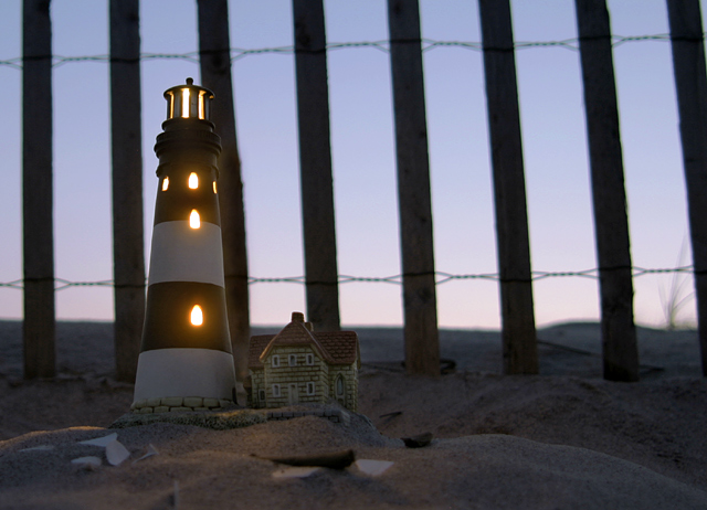
Very nice. You met the challenge and did it in a fairly pleasing way. IMO, this was a tough challenge that made very little sense to me (which is why I did not bother entering it). It seemed more about being a quirky challenge then being one designed to further creativity. I won't say that this is something I would hang on my wall, but considering the silliness of the challenge, you managed to create an actual composition, not just a random visual record of a miniature object. |
|
|
|
08/10/2004 12:53:59 AM |
|
I really like this photo. |
|
|
|
08/07/2004 03:34:46 PM |
|
|
|
08/07/2004 12:51:50 PM |
|
Beautiful lighting of lighthouse. I found the background blurred and was uncertain if it enhanced the focus on the miniature. The strong fence lines against the sky competed for my attention. I enjoyed searching the dark for white shapes on the forground and details on the house to the right. Great shot. |
|
|
|
08/07/2004 09:52:55 AM |
|
|
|
08/05/2004 12:41:46 PM |
|
I like this one. For my personal taste I would have liked to have seen some more light kicked in to light up the front of the light house some more. I also would have liked to have seen the lighthouse closer to the fence for two reasons. One, so that the size of the light house was more evident and second, so that the lighthouse tower would fit better between the fence posts allowing better seperation between the tower and the fence. |
|
|
|
08/05/2004 10:17:38 AM |
|
|
|
08/05/2004 12:38:49 AM |
|
thats really beautiful, man. |
|
|
|
08/04/2004 11:50:20 PM |
|
i really like this shot. the mood and tone are just right. the lightly saturated sky really makes me feel like i'm at the beach. if i had a nit about it, i'd probably like to see what a deeper dof might have looked like with the lighthouse and fence both in focus. |
|
|
|
08/04/2004 05:49:44 PM |
|
|
|
08/04/2004 04:54:06 PM |
|
Nice compostion and shot. Really well done. 9 |
|
|
|
08/04/2004 11:18:57 AM |
|
This is a great idea and picture! |
|
|
|
08/04/2004 10:37:34 AM |
|
Original. Shouldn't the lighthouse be on the other side of the fence? |
|
|
|
08/04/2004 02:02:14 AM |
|
|
|
08/04/2004 01:07:51 AM |
|
Cool colors, nice to look at again and again. |
|
|
|
08/04/2004 12:41:09 AM |
|
Just a little bit of light to the front of the lighthouse, not flash, possible reflected onto it with a whiteboard..would have given this some "pop". Good job nonetheless. |
|
 Photographer found comment helpful. Photographer found comment helpful. |
Home -
Challenges -
Community -
League -
Photos -
Cameras -
Lenses -
Learn -
Help -
Terms of Use -
Privacy -
Top ^
DPChallenge, and website content and design, Copyright © 2001-2026 Challenging Technologies, LLC.
All digital photo copyrights belong to the photographers and may not be used without permission.
Current Server Time: 06/29/2026 09:12:05 AM EDT.