| Image |
Comment |
| 01/29/2009 05:07:50 AM |
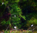
Number 4 - Descending by KelliComment: This is very impressionistic Kelli. I like the treatment you've done to this. The painter effect has really brought out the underlying colours in the leaves. |
 Photographer found comment helpful. Photographer found comment helpful. |
| 01/29/2009 05:04:20 AM |
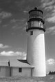
Highland Lighthouse (APAW-3bw)by PGerstComment: I like the B&W version better than the colour. I really brings out the stark white of the lighthouse tower which in turn leads the eye to the light chamber. |
| Photographer found comment helpful. |
| 01/29/2009 04:53:50 AM |
|
| Photographer found comment helpful. |
| 01/23/2009 09:27:10 PM |
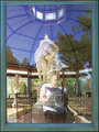
Wood Turnerby DistantColoursComment: Hey Darren...this was my pick for the blue.....don't feel too bad (and I know that's very easy to say...I'd be really pissed off)....but whether it's been DQ'd or not, you've still got the knowledge that during voting it was the 5th most popular image out of 530 entrants! |
| Photographer found comment helpful. |
| 01/23/2009 06:25:11 AM |
Punkby yakatmeComment: This was one of my top 3. Simple but exquisitely done. Congrats on your top 7% finish. |
| Photographer found comment helpful. |
| 01/23/2009 06:19:31 AM |
|
| Photographer found comment helpful. |
| 01/23/2009 04:04:27 AM |
Transitions by IvoryComment: Hey! Way to go Sue. Simply a stunning image of a very gorgeous model. Congrats on your yellow. |
| Photographer found comment helpful. |
| 01/23/2009 03:51:40 AM |
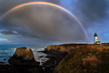
Lighthouse Drama by DrakeComment: Definitely one of my favourites in the challenge. Congratulations on a well deserved ribbon. |
| Photographer found comment helpful. |
| 01/23/2009 03:49:53 AM |
|
| Photographer found comment helpful. |
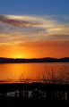
| 01/21/2009 04:03:08 PM |
Week 3: Sunset on the Bayby tinky2Comment: Maybe tweaked a little too much for my eye. I think I'd like the lower 2/3rd's toned down just a little. The sky and clouds above the main cloud bank are brilliant. I agree with Neil  nshapiro nshapiro about trying to lighten up the pond to get a bit more colour in the reflections off the water. If this can't be achieved then I think I'd crop to just below the the reeds and exclude the pond. |
| Photographer found comment helpful. |
Home -
Challenges -
Community -
League -
Photos -
Cameras -
Lenses -
Learn -
Help -
Terms of Use -
Privacy -
Top ^
DPChallenge, and website content and design, Copyright © 2001-2026 Challenging Technologies, LLC.
All digital photo copyrights belong to the photographers and may not be used without permission.
Current Server Time: 07/25/2026 01:53:31 AM EDT.