| Image |
Comment |
| 02/22/2007 11:17:09 AM |
|
 Photographer found comment helpful. Photographer found comment helpful. |
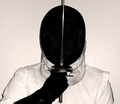
| 02/22/2007 10:13:05 AM |
Fear and Loathing in Las Menteby CutterComment: Great "theatrical" lighting. (I have no idea what that means, but it sounds good). You've really created the sense of dimension well with the lighting. I would have loved to seen this idea (and shot) in the low key challenge with the dude in the back darkened. Anyway, I'm just rambling..great shot overall. I would give it a 10 if the shadow/light line wasn't so harsh following the outline of the "stalker". Perhaps if his shirt and left hand were a bit darker? Solid 9 though. |
| Photographer found comment helpful. |
| 02/22/2007 10:06:22 AM |
Civilized Hatredby AspenDComment: 3 because of the harsh direct lighting and kinda boring composition. Sorry. It would have been better without the flash (making it low key maybe?) or bouncing the flash (if possible) off the ceiling or behind you. Also, maybe move the subject away from the wall several feet? |
| Photographer found comment helpful. |
| 02/22/2007 10:01:41 AM |
|
| Photographer found comment helpful. |
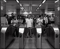
| 02/22/2007 09:58:55 AM |
Hate queuing?by boodComment: Those two girls on the left really do hate it don't they? Good capture. 8 |
| Photographer found comment helpful. |
| 02/22/2007 09:57:50 AM |
|
| Photographer found comment helpful. |
| 02/21/2007 04:04:15 PM |
|
| Photographer found comment helpful. |
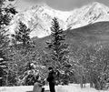
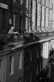
| 02/21/2007 01:45:32 PM |
galleryby tcmartinComment: I love the tones. To me this is definately street photography style and is a good shot overall. Maybe you won't get to many low votes because a human isn't in it. 7 |
| Photographer found comment helpful. |
| 02/21/2007 01:43:07 PM |
The watcherby mambaComment: I hope you don't get to many low votes because of no street. To me this is pretty classic and is well composed. 8 |
| Photographer found comment helpful. |
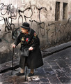
| 02/21/2007 01:29:37 PM |
Waiting to Dieby Dr.ConfuserComment: I really don't like your title. I'm giving you an 8 because I like the photo, but that title is just, well, just...words escape me. I would like it even better with some more space in front of her. I also like the slight blur of her front foot indicating motion. |
| Photographer found comment helpful. |
Home -
Challenges -
Community -
League -
Photos -
Cameras -
Lenses -
Learn -
Help -
Terms of Use -
Privacy -
Top ^
DPChallenge, and website content and design, Copyright © 2001-2026 Challenging Technologies, LLC.
All digital photo copyrights belong to the photographers and may not be used without permission.
Current Server Time: 06/22/2026 08:57:02 AM EDT.