| Image |
Comment |
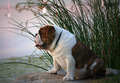
| 07/24/2007 08:43:34 AM |
Meditationby chloe noelComment: I havnen't voted many of the pet portraits high, but this one is really good, I like the surroundings included and the light is beautiful. |
 Photographer found comment helpful. Photographer found comment helpful. |
| 07/24/2007 08:27:43 AM |
the red brideby xtianComment: High marks, but the overly brightened left eye is unnatural looking. Love the color scheme and great use of light....8 |
| Photographer found comment helpful. |
| 07/18/2007 08:42:57 AM |
|
| Photographer found comment helpful. |
| 07/13/2007 04:59:45 PM |
|
| Photographer found comment helpful. |
| 07/13/2007 04:18:16 PM |
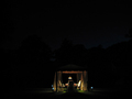
A divine nightime picnicby rgiltner1Comment: I would love to be able to see what is in the background. I realize that is the point of the photo, but just a little light maybe? I think in order for this to work the picnic area would have had to had been very sharp and off centered... |
| 07/13/2007 04:15:55 PM |
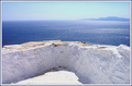
my lovely dreamby chimaeraComment: Very interesting photo. I like how the ice? points out into the sea. I think some additional contrast (with a tone curve perhaps?) would have helped it out. Great control over the exposer though with all that bright light. |
| Photographer found comment helpful. |
| 07/13/2007 04:14:19 PM |
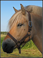
Dreaming af a Pony like thisby NuserComment: I like the "softness" of the pony, but the lighting seems very flat and the composition not really exciting. The fence is also a little distracting. I think a really shallow DOF and a tighter crop would have made the pony stand out better. 5 |
| 07/13/2007 04:10:55 PM |
|
| Photographer found comment helpful. |
| 07/13/2007 04:09:39 PM |
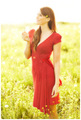
A Midsummer Dreamby LalliSigComment: very nice high key photo. Just a couple of constructive thoughts from someone who doesn't really know anything....I don't mind the blown sky, but I would have liked to been able to see the flower in her right hand. The bleeding of harsh light onto her face is distracting. I would like to have seen more space in front of her (crop closer on the right) for her to gaze into....and maybe a little more space overall around her.
The photo has great impact though and negates a lot of those nitpicky things above....8 |
| Photographer found comment helpful. |
| 07/13/2007 04:06:30 PM |
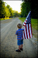
The Road Aheadby gotrondComment: Good use of perspective and subject matter. I'm not sure why this photo doesn't just grab me though. Maybe it is the blown out sky or mixed color tones. The composition is fine and good clarity. I hate to give you a bad score and not be able to explain why. I'm giving it a 6. I hope someone else is able to comment better. |
| Photographer found comment helpful. |
Home -
Challenges -
Community -
League -
Photos -
Cameras -
Lenses -
Learn -
Help -
Terms of Use -
Privacy -
Top ^
DPChallenge, and website content and design, Copyright © 2001-2026 Challenging Technologies, LLC.
All digital photo copyrights belong to the photographers and may not be used without permission.
Current Server Time: 06/23/2026 03:52:39 PM EDT.