| Image |
Comment |
| 10/24/2007 08:20:49 AM |
|
| 10/24/2007 08:20:11 AM |
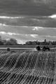
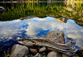
shock baleby undieyatchComment: beautiful layers of clouds and hills and textures - i don't really get a strong sense of 'from the ground up, however' - still a 6 |
| 10/24/2007 08:19:17 AM |
|
 Photographer found comment helpful. Photographer found comment helpful. |
| 10/24/2007 08:18:41 AM |
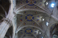
Nothing small hereby BigdadComment: love the inside of churches - especially beautiful ones like this - the angle and crop really doesnt work for me - i feel as if I am leaning to the right here |
| Photographer found comment helpful. |
| 10/24/2007 08:17:31 AM |
|
| Photographer found comment helpful. |
| 10/24/2007 06:49:42 AM |
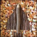
T i M B e R by sherpetComment: Absolutely Awesome Shez!!! Congrats on the ribbon. Such a great macro and such a wonderful interpretation of the challenge. |
| Photographer found comment helpful. |
| 10/24/2007 06:14:09 AM |
|
| Photographer found comment helpful. |
| 10/24/2007 06:01:17 AM |
The Toll Bridgeby MAKComment: Marac - I really thought this was going to place higher - the feel of this one is really outstanding. Excellent leading lines, wonderful balance of the two young men, really solid contrasty b/w image. |
| Photographer found comment helpful. |
| 10/24/2007 05:34:24 AM |
Someone You Can Look Up To by SandyPComment: Sandy, This is too cool for school. Great job on this image. You have captured such humor and natural delight with this shot. Congrats on the Blue - SOOOOO deserving! |
| Photographer found comment helpful. |
| 10/23/2007 10:19:30 PM |
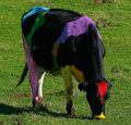
Colourful Cowby IvoryComment: Where do you find these cool animals in these strange colors? I can only ever seem to find black and white ones where I live.
The painting is really good on most of the cow, but the red on the head just seems just a bit too red.. |
| Photographer found comment helpful. |
Home -
Challenges -
Community -
League -
Photos -
Cameras -
Lenses -
Learn -
Help -
Terms of Use -
Privacy -
Top ^
DPChallenge, and website content and design, Copyright © 2001-2026 Challenging Technologies, LLC.
All digital photo copyrights belong to the photographers and may not be used without permission.
Current Server Time: 06/20/2026 10:18:49 PM EDT.