| Image |
Comment |
| 12/16/2007 11:55:19 AM |
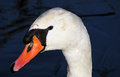
Day 2 - The Queen's Swanby jonfrommkComment: Nice swan - the colors are nice and vibrant, the placement of it's head makes it seem like it is bowing a bit to us to acknowledge our presence.
Sour - I am not sure about the neg space on the right - I think having more negative space to the left would have made this compositionally more balanced. Can you edit and add the right hand side to the left and see how that comes out....
Oh heck...I will!!!
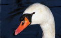
I also cleaned up the poor bird's feathers. Come on Jon! - don't you have any compassion for a beautiful creature!? |
 Photographer found comment helpful. Photographer found comment helpful. |
| 12/16/2007 11:42:25 AM |
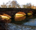
Day 3 - Town Bridgeby jonfrommkComment: Jon
Excellent stuff all around.
Things I like: the frost in the foreground to add some depth to the grasses, the repeating shapes of the arches under the bridge, the brightness of the sun on the rocks, the balance of the dark foreground and the brigthness of the sky above the bridge, the placement of the top of the bridge
Things I would work on - the water in the lower right has some wonderful textures - i almost think some dodging in the mids and highlights would really bring this out even more. I would also consider bringing out the foreground a bit more - it is such a nice touch to the image to convey winter. On the crop - the little post on the upper left side - make a decision - is it in or is it out!?
Sweet stuff Jon! |
| Photographer found comment helpful. |
| 12/16/2007 11:07:57 AM |
|
| 12/16/2007 10:43:47 AM |
|
| Photographer found comment helpful. |
| 12/16/2007 10:42:43 AM |
|
| Photographer found comment helpful. |
| 12/16/2007 10:40:35 AM |
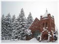
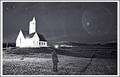
Portal to heavenby asijComment: Very creative take . THe distortion of the chuch is a very strange effect, but that is one cool ring that the 'traveler' is looking at |
| Photographer found comment helpful. |
| 12/16/2007 10:39:31 AM |
Truthby fuzzytComment: clearly fits the challenge in my book. But, to be honest, the shot does not hold a great deal of interest. There is too much of the plain blue sky and the light over the roof would likely have come off a lot better if it were behind the cross - emphasizing the theme you were going after. |
| Photographer found comment helpful. |
| 12/16/2007 10:38:00 AM |
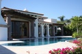
Heaven's a Houseby Travman1925Comment: Really nice capture of the house, the trees in the background and the pool in front. I just am not sold on the out of focus flowers in the foreground. They seem to add more distraction to the photo. If you selected a much smaller apeture, you could have potentially got all in focus and this would come off a bit better. The other option would have been to get closer to the flowers and make them more pronounced and use the OOF flowers to frame the shot in a nice way. |
| Photographer found comment helpful. |
| 12/16/2007 10:35:42 AM |
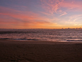
Azulesby oniblisComment: i like the layers of blue that you have captured - i just don't see a specific item to draw me into the photo. The sky seems a bit noisy and the overall image is a bit blurry or out of focus. |
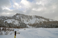
| 12/16/2007 10:34:07 AM |
Nordic Solitudeby WCpilotComment: pretty scene - the tips of the ski poles actually provide an unnecessary distraction to the shot. more of the ski poles or a skier in the frame would have worked better here |
| Photographer found comment helpful. |
Home -
Challenges -
Community -
League -
Photos -
Cameras -
Lenses -
Learn -
Help -
Terms of Use -
Privacy -
Top ^
DPChallenge, and website content and design, Copyright © 2001-2026 Challenging Technologies, LLC.
All digital photo copyrights belong to the photographers and may not be used without permission.
Current Server Time: 06/23/2026 05:52:12 AM EDT.