| Image |
Comment |
| 03/27/2007 09:50:16 PM |
MinimalDay18Web1by cogeroxComment: roger... excellent .. excellent ... love the colours duplicated in his shirt and the fish .. love the child's posture and his expression .. like 'wots more interesting? .. obviously not the fish!!' .. love the contrast between the dark in the fish tank and the outside .. a great shot ...... |
 Photographer found comment helpful. Photographer found comment helpful. |
| 03/27/2007 03:24:45 AM |
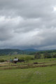
MinimalDay17.2Web.jpgby cogeroxComment: it really is a beautiful image without the sun, but the sun is like you've gone and given it a lift in photoshop!! .... and i can see by where the animals are that this would've been within a couple of minutes of your sun image ... amazing wot a few minutes can do eh?? .. you know i do like the deeper green in this one in the foreground tho ....... in fact i think this one is taking my fancy now .... seems like i'm all confused!! ... be great to just give the 'appearance' of sunlight on the buildings, the animals and that general area, which'd create a focal point in the image .. just my opinion and you should know by now, i cant look at a photograph without seeing things i'd like to do to it in photoshop ....
did i tell you about the post processing challenge site started by jeff  smurfguy smurfguy
this is the link post processing challenge .. its where people submit one of their own photographs for other ppl to edit ..... i had submitted one of my cow shots and it was extremely interesting to see how other ppl approached the edit of that photograph ... |
| Photographer found comment helpful. |
| 03/27/2007 03:14:27 AM |
Slippery Circlesby cogeroxComment: came to check out your other stuff and hadnt seen this excellent circle entry ...... fantastic idea with your angle .. it should have done heaps better in the challenge .. but as i always say ...'the voters suck'.. obviously they wont when i get better scores tho !!...
just read don's posthumous comment .. couldnt have said it better myself .. if you're different then you'll suffer the consequences!!!!!!!! ... and i shall continue to do so ........... |
| Photographer found comment helpful. |
| 03/27/2007 03:07:29 AM |
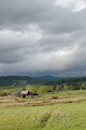
MinimalDay17Web.jpgby cogeroxComment: stunning shot and absolutely worth all that mucking around .. like going home disappointed and not being able to hand around, coming back and nothing, waiting around and then bammmmmm.. i'd have been quite excited!!! knowing the light was a very short lived thing & hoping to get a great shot in the limited time etc etc .. love your composition .. the light is awesome .. we've been having lots of thunderstorms lately and when the it combines with sunlight its just amazing ... so intense ...
the colours in this unedited image are just beautiful right now .. |
| Photographer found comment helpful. |
| 03/27/2007 02:58:51 AM |
Seven Knot Grin.JPGby MelonMusketeerComment: wow ... just read the lengths you've gone to get this excellent shot ... it was totally worth it ... an excellent 'action' shot with great perspective and love the light shining thru the sails and that expanse of open sea in the background ... you certainly wouldnt want to be a fumble fingered type like me ... losing a camera and fish eye lens to the sea could be an extremely unpleasant experience!!! ..
and before i read roger's comment i didnt really understand wot you meant by a picture stick ... amazing paraphenalia we have to support our 'interest' in photography .. its more an 'obsession' for me, but i didnt think i should infer you had personality problems like my own re photography!! .. i'm too nice, unlike roger!!!
was driving to acupuncturist today and sorta wondered where you were coz i thought you'd be in for the rest of the 'party', just forgot u'd gone away for the weekend .. excellent to have you back .... Message edited by author 2007-03-27 03:00:31. |
| Photographer found comment helpful. |
| 03/26/2007 05:58:43 PM |
MinimalDay16.1Web.jpgby cogeroxComment: love the beautiful colours in this as well as the excellent abstract feel ... i can be inclined to get a bit 'busy' so the simplicity of this grabs me too ... |
| Photographer found comment helpful. |
| 03/26/2007 01:07:53 AM |
Charlieby IvoryComment: gorgeous portrait sue ... love everything about it ... great composition, great natural look and i love the expression.. the colouring is just perfect ... his eyes and his hair ... an extremely beautiful lookin guy!!! ... i reckon this should've done heaps better ... |
| Photographer found comment helpful. |
| 03/26/2007 12:40:35 AM |
The IT Factorby SandyPComment: excellent pose ... cheeky ... congratulations on a fantastic photograph ... love the composition and the feel of this one .. she's gorgeous... |
| Photographer found comment helpful. |
| 03/26/2007 12:38:34 AM |
Natural Beautyby lentilComment: hi lisa ... beautiful photograph .. gorgeous colours, pose and composition .. stunning girl ..... |
| Photographer found comment helpful. |
| 03/25/2007 06:22:05 AM |
Our Familyby sherpetComment: hey shez ... a beautiful family photograph ... that baby will have so much love ....... |
| Photographer found comment helpful. |
Home -
Challenges -
Community -
League -
Photos -
Cameras -
Lenses -
Learn -
Help -
Terms of Use -
Privacy -
Top ^
DPChallenge, and website content and design, Copyright © 2001-2026 Challenging Technologies, LLC.
All digital photo copyrights belong to the photographers and may not be used without permission.
Current Server Time: 05/08/2026 02:38:07 AM EDT.