| Image |
Comment |
| 08/19/2003 01:12:53 PM |
Championsby JPRComment: Like this shot but I feel there is more space than is needed to keep the effect. Less is more here. |
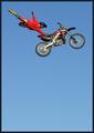
| 08/19/2003 01:08:15 PM |
Freestyler by ToddhComment: Negative space certainly adds to the effect here! Super Nice shot. |
 Photographer found comment helpful. Photographer found comment helpful. |
| 08/19/2003 01:06:36 PM |
Mt Rainierby timj351Comment: Pretty shot. I really didn't need all that sky to get the point across. Less is more. The mere fact that this picture has a beautiful 3D quality would have been enough. Cropping two thirds of the way down would have been just as efffective. |
| 08/19/2003 12:56:12 PM |
|
| Photographer found comment helpful. |
| 08/19/2003 12:55:15 PM |
Lakeside Foliage at Duskby kyrielleComment: The heavy black at the upper right is distracting to me. I think a crop one third of the way down would have been even more effective. I thoght the shadow of the leaves on the ripple of velvet blue was the key to this shot! good luck |
| Photographer found comment helpful. |
| 08/19/2003 12:51:41 PM |
Space?by dacrazyrnComment: Interesting shot. But the little specs in the black detracted from it. Clean the lens! |
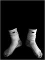
| 08/19/2003 12:49:50 PM |
Red Mary Janes and Hair Ribbonsby LindaLeeComment: Nice shot. Black needs to be real black. The upper right hand corner kept pulling my eyes away from the subject wondering what waws up there. I don see that a tighter crop would not have been just as effective. Good luck. |
| Photographer found comment helpful. |
| 08/10/2003 01:37:47 AM |
Free Stampby STEINRComment: My favorite stamp in my favorite city. Would have liked to see the colors more vivid. . . especially the pink. I always get criticised for my sky being washed out. . . but knowing this is Cleveland and how hard is is to get a shot on a nice day. . . I won't say anything about yours! Best of luck with a great shot |
| Photographer found comment helpful. |
| 08/10/2003 01:12:44 AM |
|
| 08/07/2003 02:40:53 PM |
|
| Photographer found comment helpful. |
Home -
Challenges -
Community -
League -
Photos -
Cameras -
Lenses -
Learn -
Help -
Terms of Use -
Privacy -
Top ^
DPChallenge, and website content and design, Copyright © 2001-2026 Challenging Technologies, LLC.
All digital photo copyrights belong to the photographers and may not be used without permission.
Current Server Time: 07/17/2026 03:10:12 AM EDT.