| Image |
Comment |
| 06/01/2008 03:43:24 PM |
Birds Don't Pryby simplesilentComment: A little overprocessed in my opinion. (there is some banding in the sky for instance and some haloing around the objects) |
 Photographer found comment helpful. Photographer found comment helpful. |
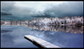
| 06/01/2008 03:42:11 PM |
|
| Photographer found comment helpful. |
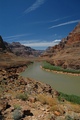
| 06/01/2008 03:41:25 PM |
Colorado in Arizonaby sh0rtyComment: This looks a little "muddy". Adjusting levels or curves would help. Beyond that, I like how the river creates a leading line into the shot. I also really like the sky you captured here. |
| Photographer found comment helpful. |
| 05/31/2008 04:24:18 AM |
|
| Photographer found comment helpful. |
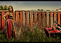
| 05/31/2008 04:23:15 AM |
Crossing The Ruinby renefunkComment: I like the tension created by her position in relation to the wall. The leading line of the shadow takes you almost to her face. The colors work well as a pseudo monochrome. Great shot |
| Photographer found comment helpful. |
| 05/29/2008 04:54:55 PM |
old waysby jamesfraterComment: Greetings from the critique club!
This was one of my favorites in the challenge. I like the mood you captured in the shot and old feeling/style which really works well with the subject. The glow is alright in my books and the lighting, while bright does give it a "glamour" look in my opinion.
The border, however, is a little thick and detracts from the image. The main purpose of a border is to signal the viewer that the image is done and not to keep looking outside the frame. With that in mind, I'd say that a border wasn't necessary. Also, you are limited with the image size. The big border you used took a significant portion of what you had to work with away from you. Generally speaking, the bigger the image, the easier it is for the viewer to appreciate. |
| Photographer found comment helpful. |
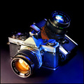
| 05/29/2008 04:48:15 PM |
An Early Kodak Digital Momentby EssAreDubyaComment: Greetings from the critique club!
As mentioned below, and with a lot of shots in this challenge, this is pretty much a generic product shot. That's not a terrible thing but it appears that those who went beyond that did better.
Beyond that the yellow works given the subject matter. I'm not normally a fan of borders but it works here.
A lot of people took their camera strap off for the shot. Not sure if it would have been beneficial here or not but something worth mentioning.
For the composition I would have considered turning the camera a bit more and getting more of an oblique.
I am guessing that this was shot handheld. If it wasn't, I would have considered shooting at a lower ISO.
Overall: Technically sound. With this challenge people were looking for that extra something. So not bad. Just not great I guess. |
| 05/29/2008 04:24:57 PM |
Sacredby SundayMorningsComment: Greetings from the critique club.
I didn't vote on your image during the challenge deliberately. I like the idea you had and appreciated the fact you tried something different. Conceptually its a great idea. In practice? Its hard to look at. Its a very bright image done this way and there's not a lot of detail. The eye is drawn to the black spots and there isn't really anything there to see.
Overall, great idea that was a hard sell to this audience. I would suggest and encourage trying things like this out. |
| Photographer found comment helpful. |
| 05/29/2008 04:09:43 PM |
Bruised. Battered. Retired...but Still Sexy After All These Years!by hotpastaComment: Greetings from the Critique club!
Nice colors and nice setup and composition. Lighting is interesting and well executed. It certainly meets the challenge.
As to why it didn't score higher? I'm not sure either. I gave this a 6 but could just as easily have given it a 7. There are a few artifacts/jaggies from resizing. One of the comments I heard or received was that a lot of the shots looked like a product shot. This is a step beyond that but I think people were looking for a bit more. (like you mention - perhaps a human element)
|
| Photographer found comment helpful. |
| 05/29/2008 01:16:56 PM |
|
| Photographer found comment helpful. |
Home -
Challenges -
Community -
League -
Photos -
Cameras -
Lenses -
Learn -
Help -
Terms of Use -
Privacy -
Top ^
DPChallenge, and website content and design, Copyright © 2001-2026 Challenging Technologies, LLC.
All digital photo copyrights belong to the photographers and may not be used without permission.
Current Server Time: 06/24/2026 11:52:59 PM EDT.