| Image |
Comment |
| 02/15/2008 09:19:38 PM |
Never to old for speedby bob_bobskiComment: LOL one of my favourites in this challenge..... the blur makes it look like she's doing 50 mph on that thing! Nicely done. |
 Photographer found comment helpful. Photographer found comment helpful. |
| 02/04/2008 08:22:03 PM |
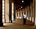
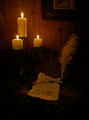
Going Homeby levyj413Comment: Don't feel like reading all the other comments, please forgive me if I repeat stuff.
I love it! I can be pretty unforgiving with blur, too often I feel that an accidental blur is being passed off as "artistic". Not in this case - it feels very much intended and makes a wonderful contrast to the static architecture.
I also love that you didn't HDR the living daylights out of this - it feels so right to see very dark areas, as well as glimpses of light coming in.
Saying that I don't care for the blue back pack would be way too picky, so I won't say it :-)
I just tried it in b+w - it looks good, too, but changes the mood quite a bit, so I'm glad you left those warm colors. |
| Photographer found comment helpful. |
| 02/04/2008 08:11:04 PM |
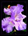
Iris (Border)by jpochardComment: As soon as I saw this photo, I wished the petals extended past the frame.
I am talking about the parts that are cut off (both left and right, about one third from the bottom). I think it would look really good if they "reached out" beyond the frame.
I love the rest of the image, very pleasing colors and triangular composition. |
| Photographer found comment helpful. |
| 02/01/2008 11:57:13 AM |
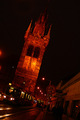
Old Way in the Old Cityby xingchenstarComment: What I like: the fabulous old building !!!!
What I don't like: the strong color cast and the lean. Plus I keep wondering what the very top of it looks like. |
| 02/01/2008 11:46:09 AM |
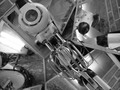
untitledby cyclingtmbComment: I don't understand this image - what is the reason for all the mirrors?
I feel overwhelmed by all that busyness. |
| 02/01/2008 11:42:17 AM |
Before Emailby geoComment: I don't care for the overly yellow color cast (I just checked how it would look without that and found it way better), but I like the subject and the composition. Nice little setup. |
| Photographer found comment helpful. |
| 02/01/2008 11:38:20 AM |
|
| Photographer found comment helpful. |
| 02/01/2008 11:33:47 AM |
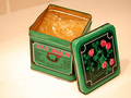
For all udder issuesby snafflesComment: Good subject, certainly on topic.
However, the photo would look better if you had taken more care with your background. A large piece of white paper curved upward behind the tin would have given you a smooth backdrop. As it is, I keep looking at the upper left hand corner trying to work out what I'm looking at. |
| Photographer found comment helpful. |
| 02/01/2008 11:29:21 AM |
|
| Photographer found comment helpful. |
| 01/28/2008 08:24:31 PM |
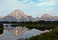
Grand Tetons National Parkby BeetleComment: Originally posted by JustinM:
Originally posted by JustinM:
This almost looks like processing that came from that new beta software "project wukong" I'm probably wrong however. |
Wow I was right |
LOL yes you were - try as I might to keep it "real", it still had a bit of that HDR look to it anyway. Perhaps I'll get better with it some day, perhaps some photos simply turn out that way. |
Home -
Challenges -
Community -
League -
Photos -
Cameras -
Lenses -
Learn -
Help -
Terms of Use -
Privacy -
Top ^
DPChallenge, and website content and design, Copyright © 2001-2026 Challenging Technologies, LLC.
All digital photo copyrights belong to the photographers and may not be used without permission.
Current Server Time: 06/12/2026 07:18:40 AM EDT.