| Image |
Comment |
| 04/23/2007 11:56:36 AM |
|
 Photographer found comment helpful. Photographer found comment helpful. |
| 04/23/2007 11:55:22 AM |
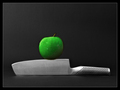
On The Edge by DUCATISTAComment: really nice composition and lighting. the two things that bother me are the black halos around the knife and apple (probably from unsharp mask) and the fact that the apple is the only thing with any color, which makes it look composited or fake somehow to me... i wish the knife had a bit of color in it -- especially a hint of green to show that the apple really is sitting on it. |
| Photographer found comment helpful. |
| 04/23/2007 03:13:15 AM |
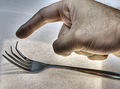
Touchby zaflaboutComment: very cool idea, and i really like the shape of the fork. there are a few things that detract from the image for me, though. the hand is pretty overwhelming in the composition, and is out of the frame a bit at the top. the weird blurry lines in the hand, also... i don't understand what they are so i keep gravitating toward them. and lastly, the hdr technique -- the way it brings out noise in the dark areas and leaves a really visible halo around the hand -- it's too much. this is a concept you should keep playing with, though -- it has a lot of possibility. |
| Photographer found comment helpful. |
| 04/23/2007 03:07:57 AM |
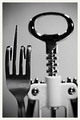
Fork Off.by shamerComment: sweet. perfectly "posed" and the play with depth of field here is also a great effect. nice composition too. the one thing that hurts the image for me is the unsharp mask haloes around the edges of the fork. |
| Photographer found comment helpful. |
| 04/23/2007 03:05:46 AM |
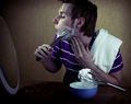
SLEEP...It's Overrated!by twmaxComment: composition is weighted too heavily toward the left, i think. also, boo on words -- they diffuse any subtext the image might have had. if you're going for the "sleep is for the weak" theme, there are more metaphoric ways of going about it (but then again, they probably wouldn't have fit with the challenge theme). |
| Photographer found comment helpful. |
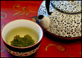
| 04/23/2007 03:02:32 AM |
Tea, anyone?by BlimComment: composition is nice, but there's some problem with the lighting. looks like it's lit from a window on the left and a room light behind the camera, which gives different color temperatures, and which flatten out the depth in the image. |
| Photographer found comment helpful. |
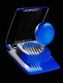
| 04/23/2007 02:59:18 AM |
Eggscapeby colorcarnivalComment: i like this -- it's abstract in a way, and has a lot of shape to it. i wish it weren't so heavily saturated, though. i think you lost some texture, especially in the eggshell, that would have come out better with less saturation. |
| Photographer found comment helpful. |
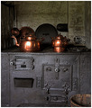
| 04/23/2007 02:54:08 AM |
The Old Stoweby silverscreenComment: very nice lighting, color and texture. i love antiques. the composition is bottom-heavy though -- there's a lot of weight there that attracts my eye to the asymmetrical iron parts of the stove, which i don't really like. i'd want it cropped to a square, such that a little is taken off of the right (to center the pots), and that it's like a 2-to-1 ratio of top area to bottom area. |
| Photographer found comment helpful. |
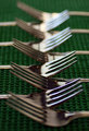
| 04/23/2007 02:50:40 AM |
Fork it Over...and over....over....by BosborneComment: this image has a lot of initial bang -- i thought "woo cool!" when i first clicked. but there are subtle asymmetries and misalignments in the composition that kind of throw it off for me. it's a really challenging concept to execute because it has to be *absolutely perfect*. i dig the tonal range though, and the simple silver-on-green. nice image. |
| Photographer found comment helpful. |
| 04/23/2007 02:46:53 AM |
A "high whisk" game of hide and seek...by splidgeComment: cute! i love the idea, and it's really well executed. something feels off to me about the composition, though. i can't quite put a finger on it. not sure, but i think i want the whisk's shadow to be more looming, somehow. |
| Photographer found comment helpful. |
Home -
Challenges -
Community -
League -
Photos -
Cameras -
Lenses -
Learn -
Help -
Terms of Use -
Privacy -
Top ^
DPChallenge, and website content and design, Copyright © 2001-2026 Challenging Technologies, LLC.
All digital photo copyrights belong to the photographers and may not be used without permission.
Current Server Time: 07/16/2026 02:43:22 PM EDT.